Haute Design With Warren Sheets: Which “White” is Right?

I’m often asked – and I also ask myself – what color of white is the best choice when painting your kitchen cabinets and the wood trim?
Traditionally, we have opted to paint trim or cabinetry Dunn Edwards’ “Swiss Coffee” – that is as about as white as you can get besides pure white (which we all know really doesn’t exist).

It is important to note, however, that selecting the “right white” is never easy, and is dependent on several factors:
The first consideration: the amount of both ambient and non-ambient light that is filtered into your home, along with the amount of daylight or artificial light. The lighter the room, the whiter the shade of white that you have chosen will appear.
Secondly, white is highly dependent on what color(s) it is adjacent to, as it readily absorbs itself into nearby colors. To fully understand how color affects other colors, note that all hues of whites contain a certain color cast. For example, a specific color has a yellowish tone, or a green cast. Or, we may say that one color is warmer or cooler than another.
Therefore, if you want to achieve a perfect color balance, and are intent on achieving the “whitest” of whites for a specific room, then carefully consider the surrounding color(s). For instance, several years ago I repainted the entry hall of our flat in San Francisco. I began by having the painter paint all of the wood trim in the entry Dunn Edwards’ “Early Snow,” what I thought to be, a “white” white.

However, when selecting the color of white for the trim, I had not taken into consideration that I would be hanging one of Schumacher’s new block print wall coverings –with a solid tone-on-tone, bright red background. After the wall covering had been hung, I was disappointed because the freshly painted white wood trim appeared to have a pale-pale pink color – not white! This was due to the red wall covering being absorbed and reflected into the white moldings.
In this particular case, had I thought it through more carefully, I would nothave used a white that contained a color base similar to the hues in the wall covering (or adjacent walls). From my experience as a scenic designer and having studied theatrical scenic design at UCLA, I knew exactly how to resolve the problem! To neutralize the pink cast, I needed to de-arm the color cast associated with the white I had selected.
As it turned out, that original white that I used had a warm cast, and in fact, contained both yellow and red hues. For white to appear “white,” I needed to make sure that its color cast came from the green side of the color spectrum, (the opposite of red), and that it neutralized the red hue. So I repainted the trim Benjamin Moore, Decorator’s White, and all was good.
In any event, knowing a white’s color cast is a great advantage.
A sampling of my favorite whites…..
For a WHITE – WHITE, use:
Dunn Edwards – Swiss Coffee
For a WARM WHITE,
where COOL Colors are adjacent, try:
Benjamin Moore Paint – Snow on the Mountain No. 1513
For a COOL WHITE,
where WARM Colors are adjacent, you may consider:
Benjamin Moore Paint – Decorator’s White
For a CREAMY WHITE,
with just a hint of Peach,
where the adjacent Colors are very light, I like:
Pratt and Lambert Paint – Half and Half No. 1844
For a Very Pale GREY WHITE,
where the adjacent Colors are not a “White – White”, try:
Benjamin Moore Paint – French Canvas No. 1514
Best of luck with your “right white” selection……When in doubt, remember to always purchase a sample pot of the color you have chosen (which most paint brands make available). Try the color against the other hues in the room, as well as in actual daylight and also in artificial light.
And let me know how it goes!
Related Articles
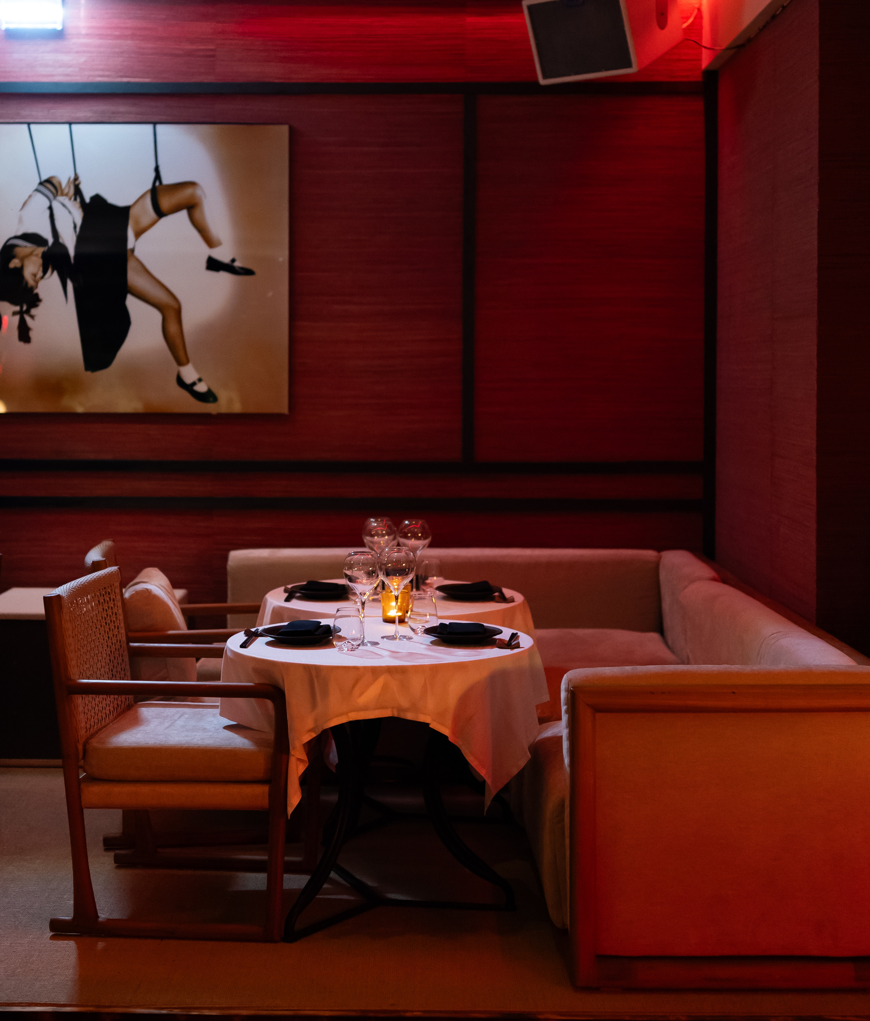
Lilly’s Introduces IZA, a New Japanese Dining Destination in Saint Tropez
Lilly’s unveils IZA in Saint Tropez, bringing Michelin inspired Japanese dining, luxury cocktails, and vibrant nightlife.
Camille Fishel’s Guide to the Absolute Best Restaurants in the Hamptons
Former Haute Living cover star Camille Fishel shares the absolute best restaurants in the Hamptons this season.
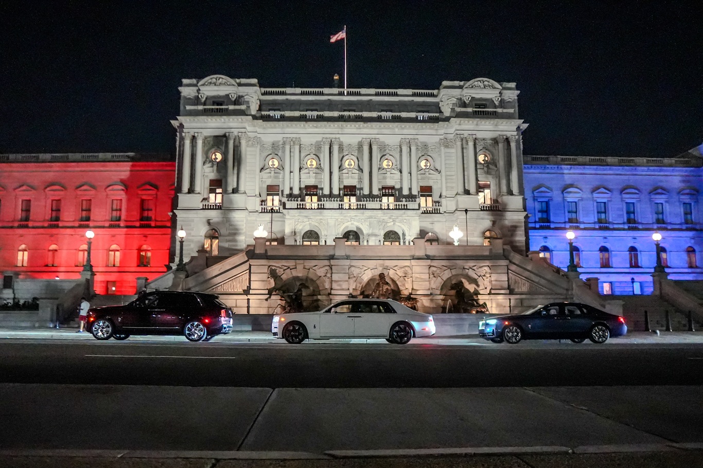
Rolls-Royce Honors America’s 250th Anniversary With Three Bespoke Masterpieces
Rolls-Royce unveils three Bespoke commissions celebrating America’s 250th anniversary with handcrafted luxury and heritage.
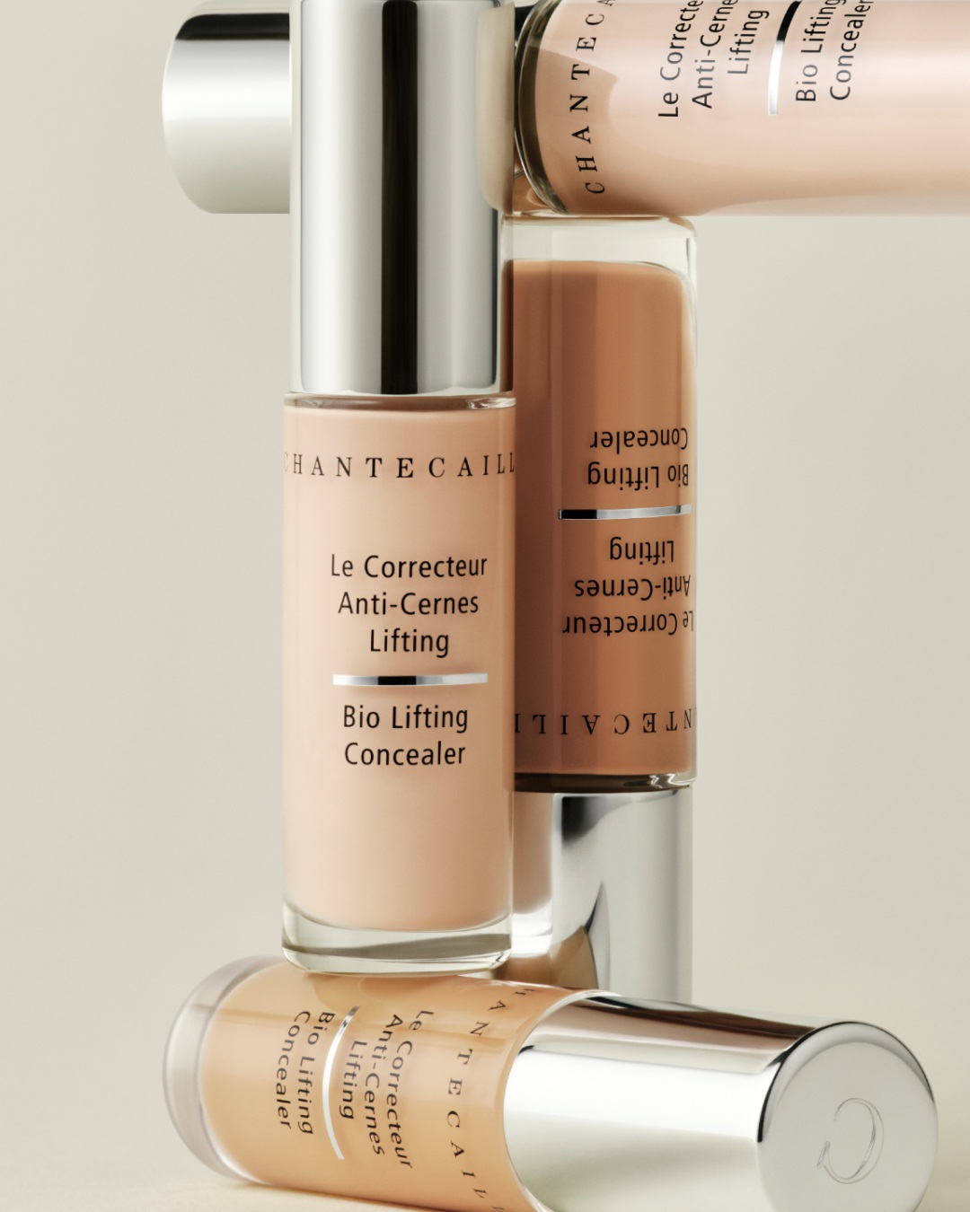
Chantecaille Expands Its Bio Lifting Collection With a New Concealer
Discover Chantecaille Bio Lifting Concealer with peptides, botanical skincare, 21 shades, and medium buildable coverage.

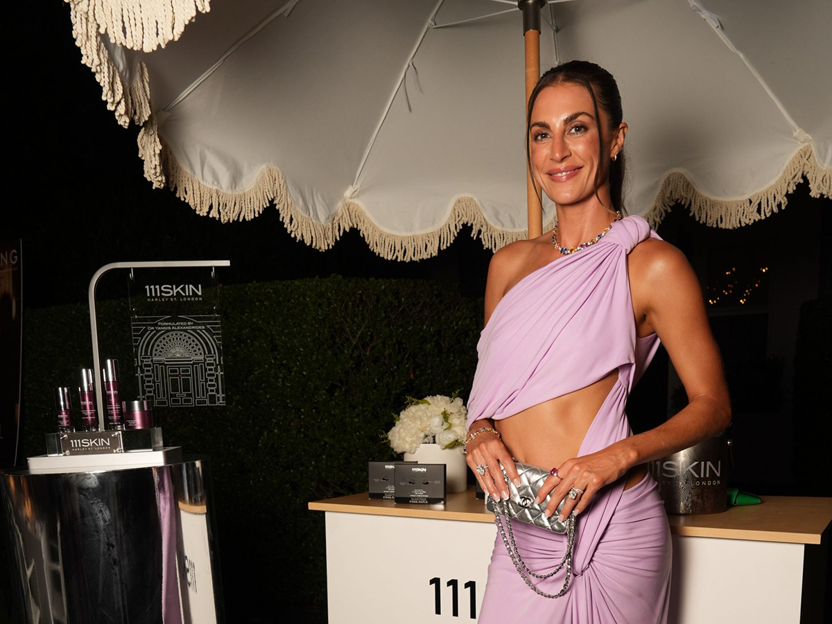
The Afties Returns to Cannes, Where Culture, Creativity, and Community Converge
The Afties returned to Cannes, uniting global leaders in sports, entertainment, business, and culture for an unforgettable night.
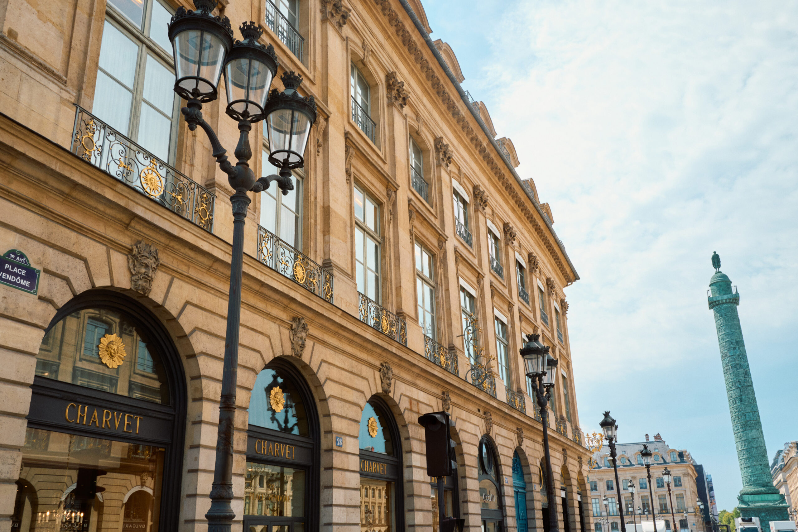
Chanel Acquires Charvet, the Last Great French Shirtmaker on Place Vendôme
Chanel acquires Charvet, the 188-year-old Place Vendôme shirtmaker — and the connection to Gabrielle Chanel runs deeper than you’d expect.
Latest Stories
Trending Articles


Related Articles
Lilly’s Introduces IZA, a New Japanese Dining Destination in Saint Tropez
Lilly’s unveils IZA in Saint Tropez, bringing Michelin inspired Japanese dining, luxury cocktails, and vibrant nightlife.
Camille Fishel’s Guide to the Absolute Best Restaurants in the Hamptons
Former Haute Living cover star Camille Fishel shares the absolute best restaurants in the Hamptons this season.
Rolls-Royce Honors America’s 250th Anniversary With Three Bespoke Masterpieces
Rolls-Royce unveils three Bespoke commissions celebrating America’s 250th anniversary with handcrafted luxury and heritage.
Chantecaille Expands Its Bio Lifting Collection With a New Concealer
Discover Chantecaille Bio Lifting Concealer with peptides, botanical skincare, 21 shades, and medium buildable coverage.
The Afties Returns to Cannes, Where Culture, Creativity, and Community Converge
The Afties returned to Cannes, uniting global leaders in sports, entertainment, business, and culture for an unforgettable night.
Chanel Acquires Charvet, the Last Great French Shirtmaker on Place Vendôme
Chanel acquires Charvet, the 188-year-old Place Vendôme shirtmaker — and the connection to Gabrielle Chanel runs deeper than you’d expect.
Subscribe to Haute Living
Receive Our Magazine Directly at Your Doorstep
Embark on a journey of luxury and elegance with Haute Living magazine. Subscribe now and have every issue conveniently delivered to your home. Experience the pinnacle of lifestyle, culture, and sophistication through our pages.


Haute Black Membership
Your Gateway to Extraordinary Experiences
Join Haute Black and unlock access to the world's most prestigious luxury events