The Inside Scoop from Linda Fargo on Bergdorf Goodman’s Big Fall News
 Photo Credit: Bergdorf Goodman
Why did Bergdorf’s undertake the redesign of the Main Floor?
Retail and fashion by their nature are quicksilver and ever-changing. The main oor of a store is its most important real estate. It sets the tone for what’s to come and establishes the DNA for the brand experience. At a time when the digital marketplace becomes increasingly seductive, the importance of a memorable, physical experience becomes increasingly urgent. For a store like Bergdorf Goodman, that holds a unique place in the fashion landscape, it’s even more essential for it to excel beyond expectation.
What were the biggest changes brought about by the redesign?
For our predominantly exclusive jewelry collections we created a new “store-within-a-store” with its own grand entrance and specially designed façade. We grew our real estate for the ever-burgeoning leather-goods business. We sought to make the product more touchable, accessible and better lit. We took glass off the cases and put more things out, to be open and at your fingertips. One of the most significant architectural gestures was the opening of a large window into the 58th street façade, allowing in views of the fountain, trees and park, and letting the store breathe with air and daylight. Conversely, from the sidewalk, the store appears less fortress-like, more inviting and approachable. As a counterpoint to the feminine classical architecture, we introduced almost brutalist, hand-hewn metalwork. Bergdorf’s inherently has patina and yet stands for the newest in design, as well. We tried to reflect that push and pull in the design ethos.
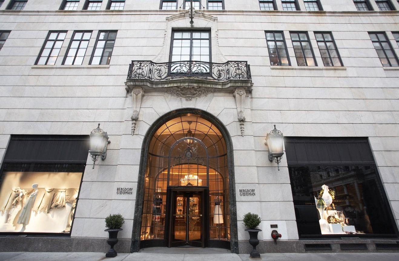 Photo Credit: Bergdorf Goodman
You and the design team wanted a timeless approach to the new design. How do you achieve that while also giving a sense of timeliness to the new space?
The Bergdorf building and its Beaux Arts bones informed our decisions. We worked off who we were and what we stood for. We would never be so foolhardy as to discard our beloved aesthetic signatures, such as the elaborate plaster-work in the Main Salon, the traditional chandeliers, even the Grand Hall layout, which is experienced as a series of ensuing spaces versus a large box space. We like the flow, crescendo and heightened anticipation of moving from one salon into another.
Why the focus on Early Modern design elements?
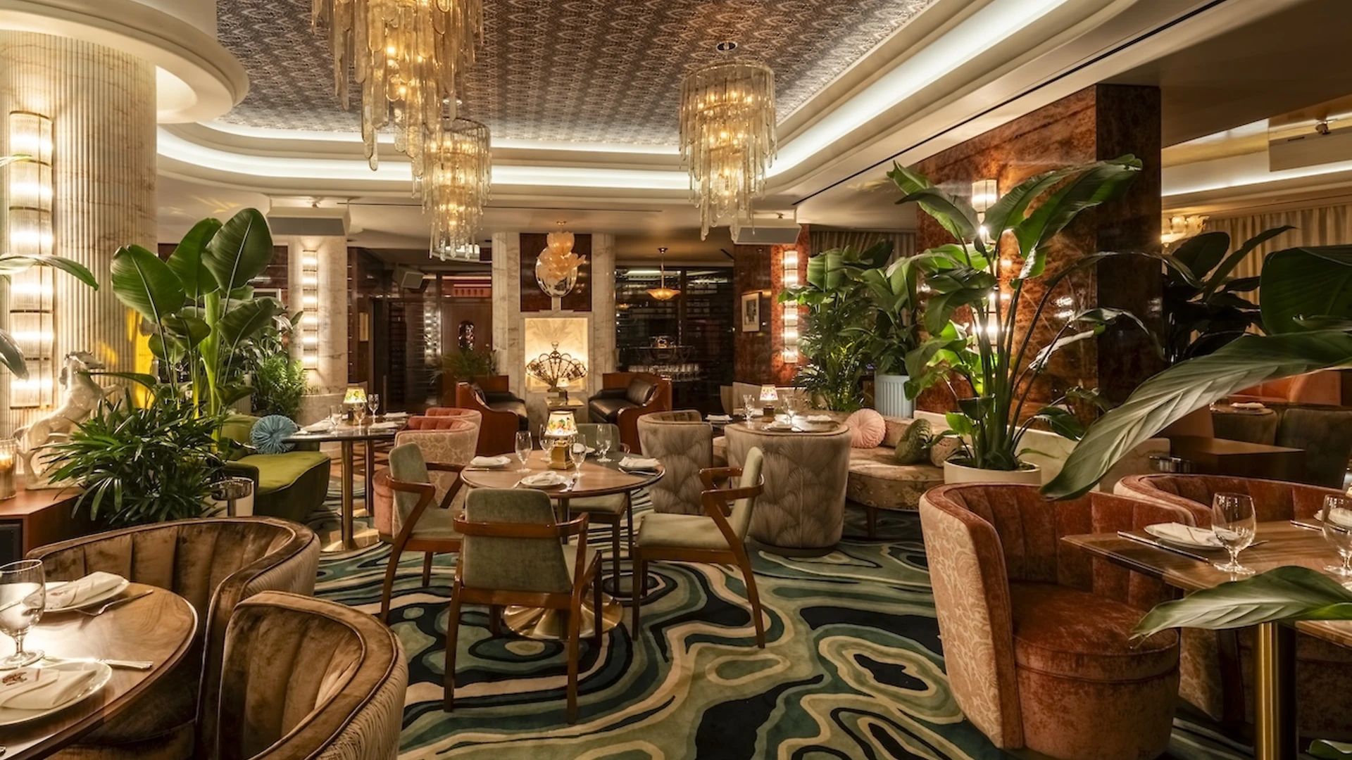
Throughout the store, we frequently use furnishings and design references from the 20s, 30s and 40s because of its everlasting appeal and its legacy as the forerunner of modern design. We chose a new color palette for the project, painting everything in various shades of pearl gray, a color which is both historical and modern.
What has been the most exciting aspect of the project for you?
Seeing people walk in for the first time and taking it all in. That’s when you know whether you’ve hit the right notes.

