4 Rooms Not To Miss At The 2019 San Francisco Decorator Showcase
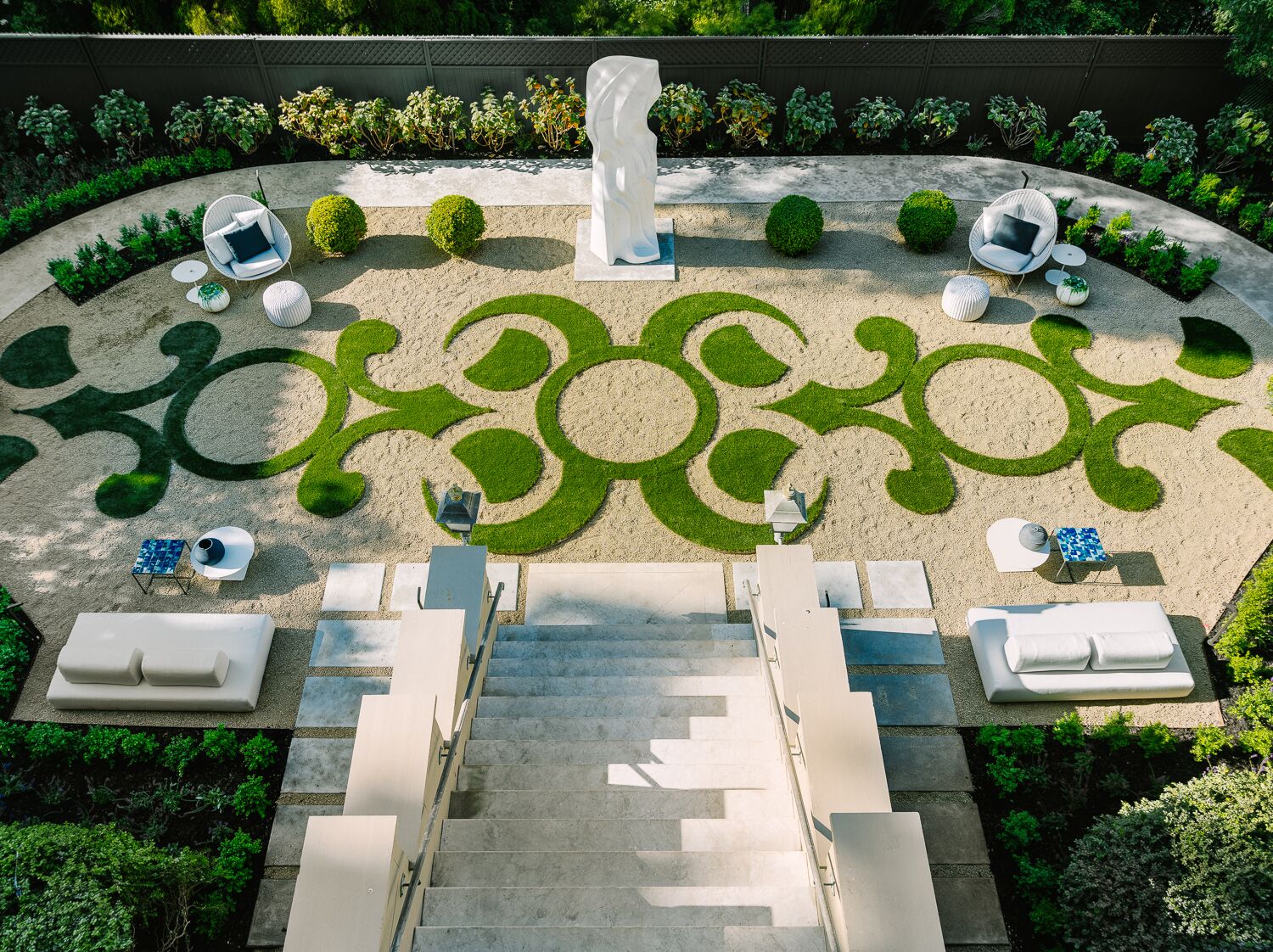
Photo Credit: Christopher Stark
The Decorator Showcase house is open for viewing and if you have not checked out the Presidio Heights property yet, what are you waiting for? Le Petit Trianon, as the residence is referred to, is one of the most stunning decorator showcases in years. Below, we share some of the insider details on our favorite rooms.
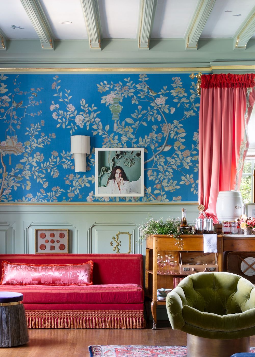
Photo Credit: Suzanna Scott
Houghton Hall Reimagined
Jonathan Rachman designed the entertainment room, Houghton Hall Reimagined. This incredible space features pretty blue wallpaper, hand painted by de Gournay’s team of artists, custom pink satin couches, and a Lex Pott chandelier. There is nothing subtle about this beautiful room. A dinner inspired Rachman that he attended in the original Houghton Hall, one of England’s most historic homes, where never before seen wallpaper panels dating back to the late 1700s were on display.
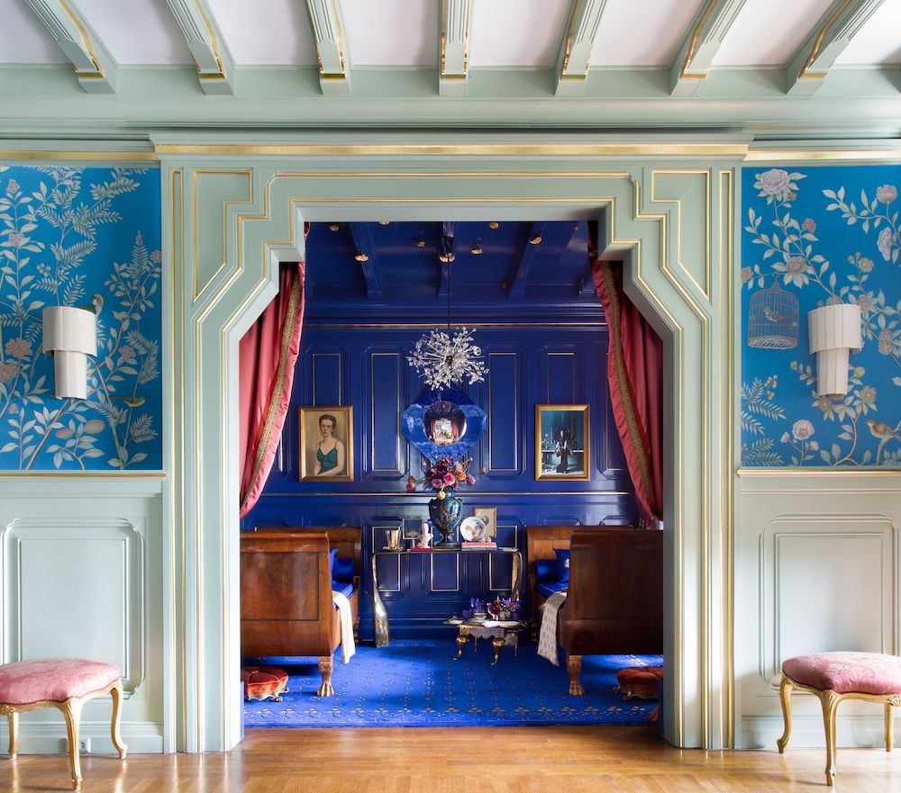 Photo Credit: Suzanna Scott
On the dinner that inspired him: “The dinner itself was an unforgettable occasion. A single table for 80 guests was set in the gallery room surrounded by exquisite artworks and with beautiful views of the famed gardens. During the evening, I was mesmerized by the grandeur of Houghton’s stone hall and the beautiful excess of the staterooms.”
On how the room should be used: “Upon arrival in San Francisco, I was determined to design a space that was inspired by my visit to Houghton Hall. The Petit Trianon in San Francisco seemed the perfect setting to realize this vision. In my entertainment room, I imagine the scene at Houghton Hall after a long state dinner when most guests have retired, but the family continues–in their finery—to entertain a few dear friends in this room. Certainly, these were occasions (and a room) to remember!”
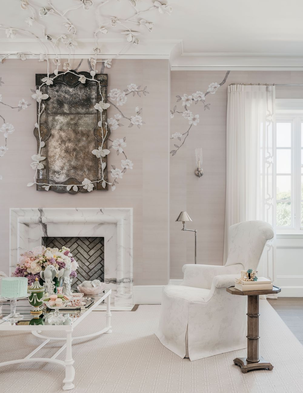
Photo Credit: Christopher Stark
Marie’s Magnolias
Visitors to Dina Bandman’s room will be invited to experience an exquisite magnolia garden. The bedroom features a pale lilac color palette with lacquered ceiling and a unique plaster treatment of white magnolia branches that trail across the ceiling. Bandman also worked with de Gournay to create a luxurious wallpaper featuring lilac magnolias on a silk mauve background with branches that descend the walls (instead of pointing up) to give the room an enveloped in flowers feel.
On the name: “All my rooms have alliteration to them, and the wallpaper usually inspires the name. Last year there were lemons on the wallpaper, and it was a nursery, so that’s how I came up with Lemon Drop Lullaby. This year, the wallpaper is magnolias, and because of how Le Petit Trianon is based on Marie Antoinette’s former home, I decided to combine the two. Feminine and fanciful in its design, this space is imagined as Marie Antoinette’s private quarters. A place where the Queen routinely sought refuge from palace intrigue—or perhaps merely created more?”
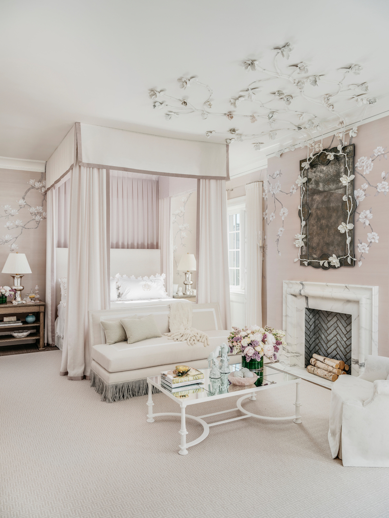 Photo Credit: Christopher Stark
On the furniture: “No master bedroom for the Queen would be complete without a fainting sofa and seating area for those who are permitted to grace her inner sanctuary. The Queen’s four-poster bed will feature whispery lightweight valances—so thin they are almost sheer, but not quite. The window treatments will be a refined wool fabric with a Holland & Sherry hand-embroidered finish, drapery perfection.”
On the fireplace and mirror: “Hung above the fireplace will be a custom mirror, framed by the same delicate plaster magnolia branches seen across the ceiling. The fireplace itself will be remade to resemble Calacatta marble—timeless and regal in its design.”

Photo Credit: Christopher StarkThe Breakfast Room
Designer Eche Martinez has a background in architecture and luxury branding, and this is clearly on view in his clean and sleek breakfast room. The Buenos Aires native and founder of the interior design firm, Eche, honored the grandeur of the turn-of-the-century house with a fresh white color palette accented with green and natural elements.
On mixing the old with the new: “I created a dining room where our imaginary family has been enjoying the start to their days for generations. The design incorporates a mix of antique, vintage and contemporary pieces to illustrate the passage of time, as well as the artistic and aesthetic sensibility each generation has brought to this grand residence.”
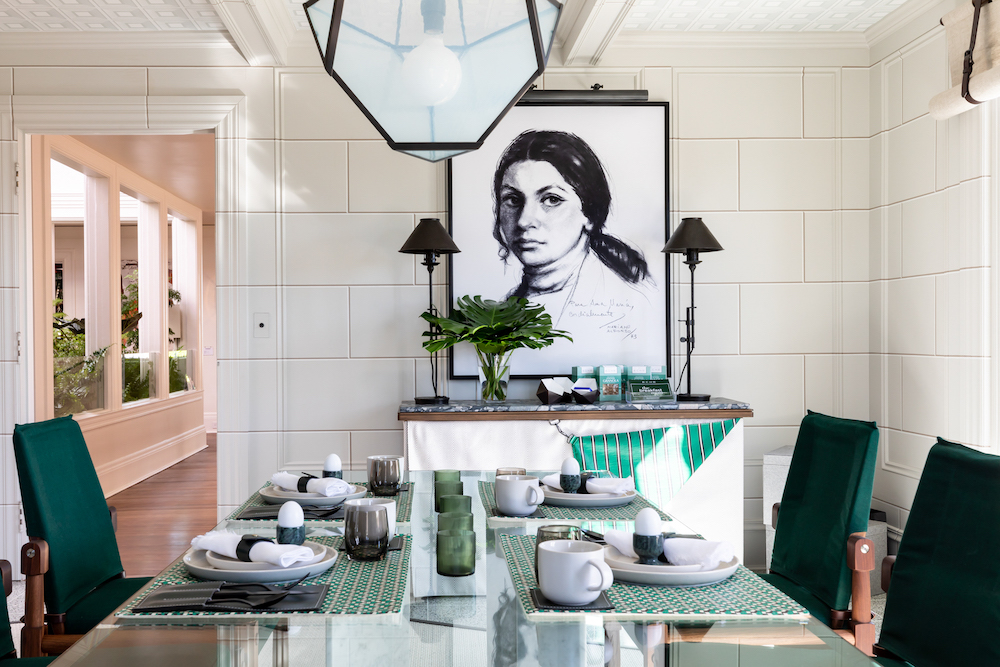 Photo Credit: Christopher Stark
On the use of greenery: “New terrazzo floors flecked with greens and grays anchor the timelessly elegant garden room atmosphere. Oversized palm trees reference the ‘Palm Court’ tradition of Palace Hotels all over the world, and enliven original wood paneling, transformed by the artistry of Willem Racké to mimic the look of an old world, limestone-clad veranda with coffered ceilings.”
On the unique painting: “The space features the “Portrait of Ana,” a 1973 illustration depicting my mother. The artist, grateful to my mom, Ana, for commissioning commercial illustrations as part of an advertising campaign created this portrait.”
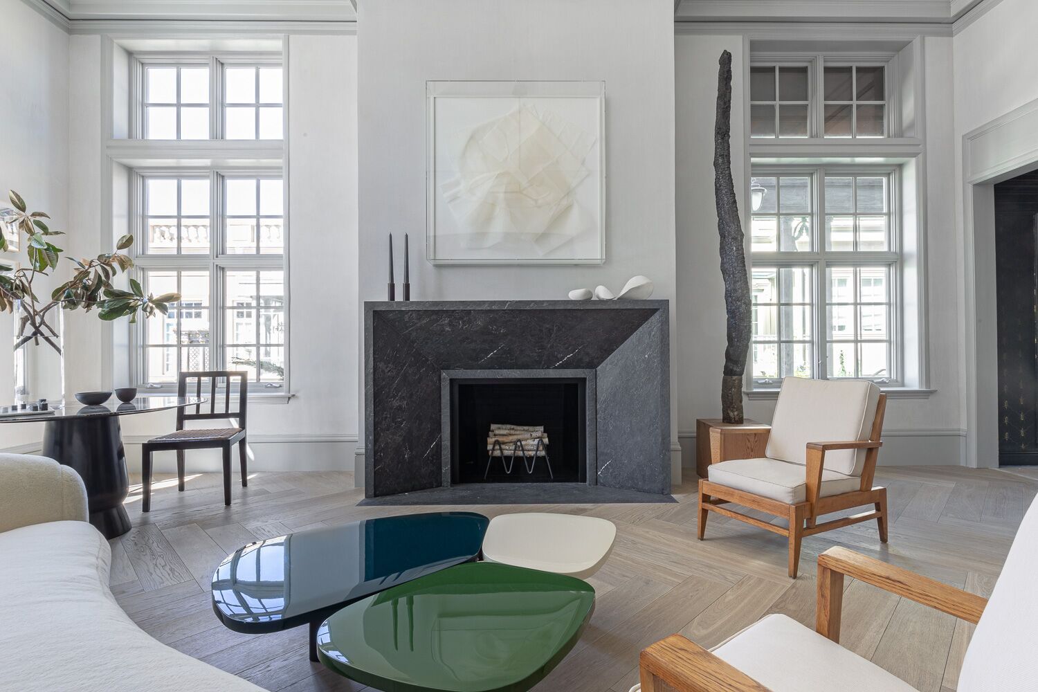
Photo Credit: David Duncan Livingston
L’Appartement
This year marks Heather Hilliard’s 8th time participating in the Decorator Showcase. It also marks her namesake design firm’s 10th anniversary. The first year she was in business was her first time doing Showcase, and she wanted to commemorate her 10 years by doing another room at the highly anticipated event. French designers crafted all of the furnishings Hilliard used, and the room features both modern and vintage pieces.
On her room: “Our design honors the historical details of this important San Francisco Landmark, Le Petit Trianon while incorporating new elements, answering the question, what would a contemporary French family desire for a gathering space? We envisioned a multigenerational French family who had been patrons of great French design over the last 250 years, and this room is a mélange of their phenomenal antique family heirlooms, iconic French vintage pieces, and pieces from the new vanguard of contemporary French designers. These elements together create a chic little family haven viewed through a California lens.”
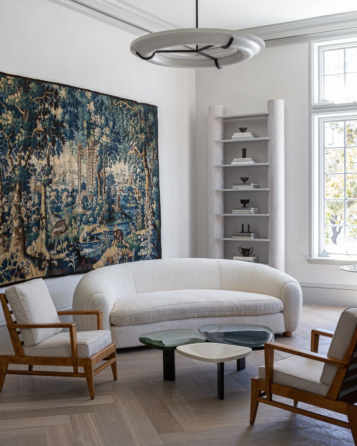 Photo Credit: David Duncan Livingston
On the name: “L’Appartement in French derives from the Italian appartare, “‘o separate, to distinguish, to set apart,’ and the Latin partem, ‘a piece, a part.’ Our design for L’Appartement is rooted sensitively in the timeless history of the Petit Trianon, but also distinguishes itself as undeniably Californian and au courant.”
On how the room should be used: “We envision this room as a gathering space for the young adults in the family to enjoy an evening cocktail before dinner. The greige of the wall plaster and painted window casings perfectly sets off the brilliant rose and coral San Francisco sunsets visible through the large South and West-facing windows during cocktail hour.”

