
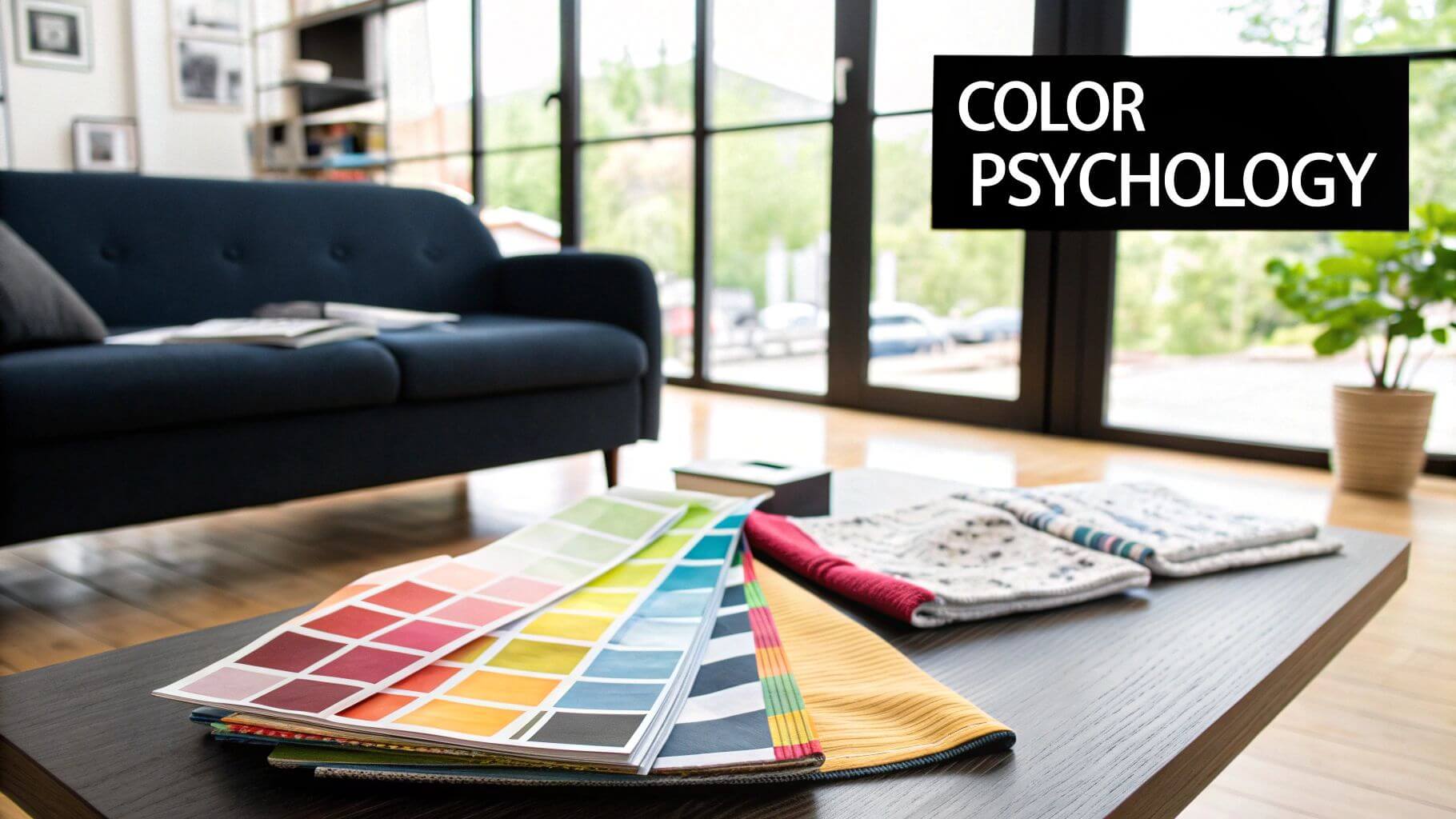
Have you ever walked into a room and felt an immediate sense of calm? Or maybe a jolt of energy? That’s not a coincidence—it’s interior design color psychology at work. This is all about how different hues subtly influence our mood, our perceptions, and even our sense of well-being. It’s the art of using color to build an atmosphere that truly connects with us on an emotional level.
The Hidden Language of Color in Your Home
It’s helpful to think of color as more than just decoration. It’s the silent architect shaping the emotional landscape of a room. The principles of color psychology go far beyond picking shades that simply look good together; it’s a deliberate strategy for crafting an experience.
The right color can make a cramped room feel open and airy, bring warmth to a chilly space, or introduce a sense of order to a chaotic one. It’s a powerful tool that can shift our perception of everything from temperature to our own productivity.
This hidden language isn’t just a vague feeling—it’s grounded in real human responses. In fact, studies have shown that between 62% and 90% of our initial assessment of an environment comes from color alone. It’s why blue is so often used to create a feeling of trust and calm, while a vibrant orange might be used more cautiously to avoid overwhelming the senses. You can dig into more of these fascinating color psychology facts on Colorlib.com.
Why Color Matters in Luxury Design
For high-end interior projects, a deep understanding of color psychology isn’t just a bonus—it’s essential. This is what elevates a design from being purely aesthetic to becoming a deeply personal and functional work of art. A luxury space is ultimately defined by how it makes you feel, and color is the primary vehicle for that feeling.
A thoughtfully chosen color palette can evoke a sense of bespoke comfort, opulence, and tranquility, turning a beautiful house into an emotionally connected home. It’s the difference between a room that looks good and a room that feels right.
Harnessing Colors for Emotional Impact
As we move through this guide, we’ll explore how to put these principles into practice. You’ll learn how to look beyond fleeting trends and start using color with real intention. We’ll get into how to:
- Shape moods: Discover which colors are best for fostering relaxation and which ones can spark energy and lively conversation.
- Manipulate space: Learn how to use color to make rooms feel larger, ceilings appear higher, or create a cozy, more intimate setting.
- Create harmony: Build cohesive palettes that guide the eye and create a seamless flow from one space to the next.
This journey will give you the tools to command color’s unseen power, helping you create interiors that are not only visually stunning but also deeply resonant with the people who live in them.
Decoding the Emotional Spectrum of Colors
Colors aren’t just visual details; they’re conversations. Think about the feeling you get walking into a room painted in a deep, fiery red compared to one wrapped in a soft, tranquil blue. The entire mood shifts instantly. This is the heart of color psychology in interior design—the understanding that every color family speaks its own distinct emotional language.
We can generally group colors into three distinct categories: warm, cool, and neutral. Each one has a unique personality and plays a different role in building the emotional architecture of a space. Once you grasp these differences, you can go from merely decorating a room to intentionally designing an experience.
The Energetic Dialogue of Warm Colors
Warm colors are the extroverts of the design world. Reds, oranges, and yellows are engaging, full of life, and have a tendency to advance visually, making a space feel cozier and more intimate. These hues are known to spark conversation, boost energy levels, and even stimulate the appetite, which makes them powerful tools for any social space.
This infographic breaks down the core emotional associations of key warm colors.
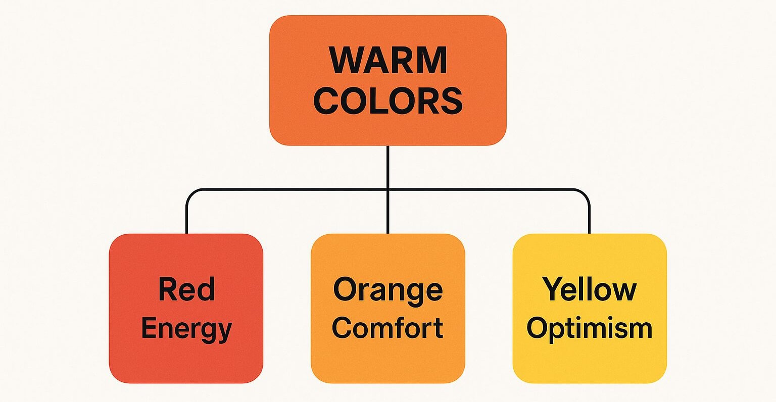
You can see how the general vibrancy of warm tones branches out into specific feelings, from the passionate power of red to the cheerful optimism of yellow.
Imagine a high-end dining room. A touch of crimson on an accent wall or in the upholstery doesn’t just add color; it cultivates an atmosphere of passion and luxury. It encourages lively dinner party conversations and makes the entire experience feel more memorable. In the same way, a soft terracotta in a living room can make the space feel incredibly welcoming, inviting guests to settle in and connect.
The strategic use of warm colors is about injecting life and personality. In a luxury context, this isn’t about shouting with color, but about creating pockets of warmth and intimacy that draw people in.
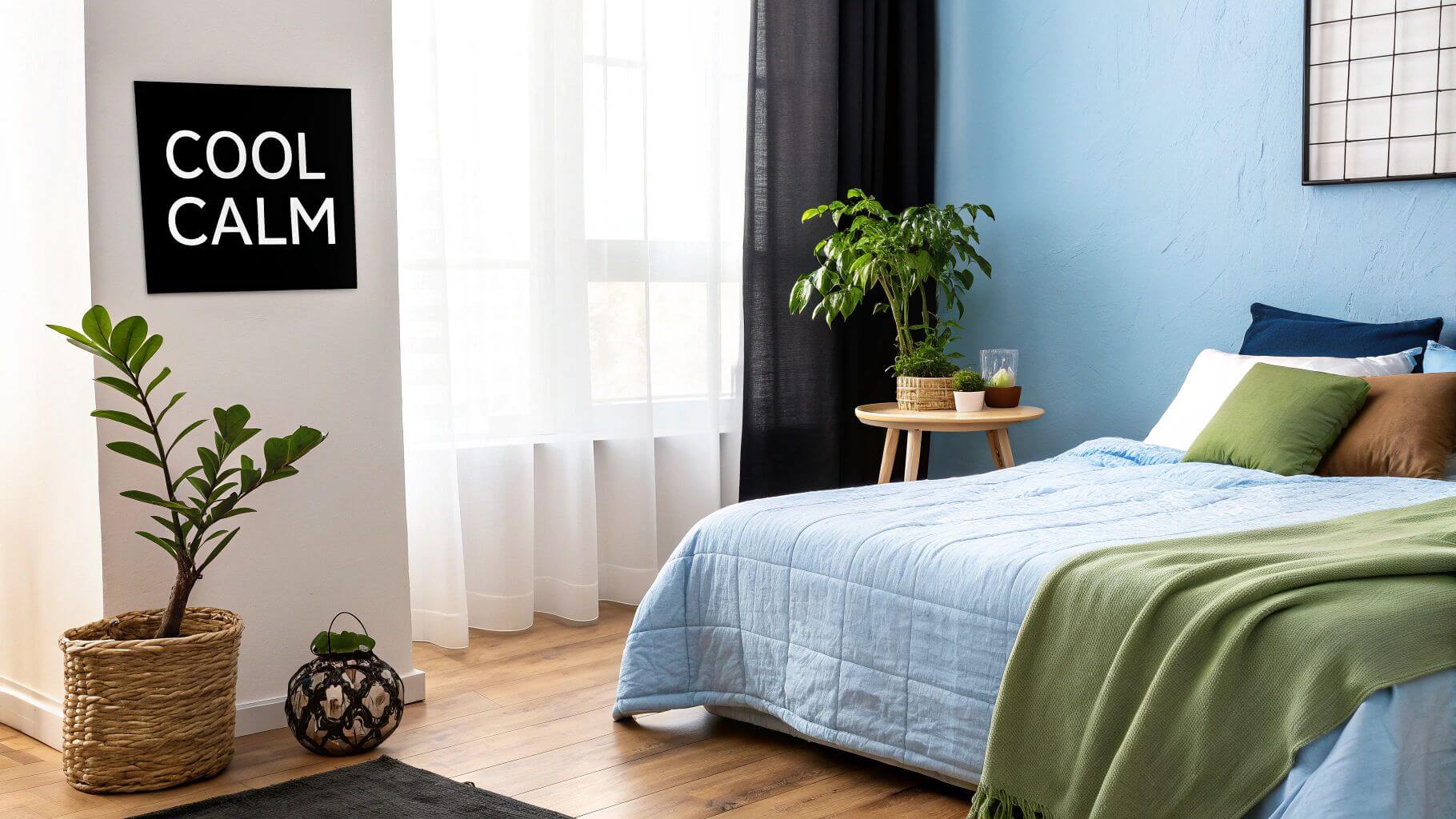
The Soothing Whisper of Cool Colors
If warm tones are the life of the party, then cool colors—blues, greens, and purples—are the calm, collected confidants. These shades recede visually, an effect that can make a room feel more spacious, open, and serene. Their psychological impact is deeply rooted in nature: the vastness of the sky, the tranquility of water, and the restorative calm of a forest.
This connection to the natural world makes them perfect for creating personal sanctuaries within a home.
- Blues: Known to lower blood pressure and slow respiration, blue is ideal for bedrooms and bathrooms. A deep navy can create a sophisticated, cocoon-like feeling, while a lighter sky blue feels airy and refreshing.
- Greens: As the easiest color for the human eye to process, green is restful and balancing. It’s an excellent choice for home offices where focus is key, or in any space designed for pure relaxation.
- Purples: Lighter purples like lavender can be serene and calming, while deeper shades like plum feel dramatic and luxurious. They are often associated with creativity and spirituality.
When designing a primary suite, for example, a palette of sage green and soft lavender can transform it into a genuine retreat from the outside world. To explore this further, our guide on how to choose paint colors offers practical steps for finding the perfect shades.
To help you keep these distinctions clear, here is a quick-reference guide to the psychological impact of different color families.
Color Families and Their Psychological Impact
| Color Family | Primary Psychological Effect | Best Suited For |
|---|---|---|
| Warm (Reds, Oranges, Yellows) | Energizing, Passionate, Inviting | Dining Rooms, Living Rooms, Kitchens |
| Cool (Blues, Greens, Purples) | Calming, Serene, Restorative | Bedrooms, Bathrooms, Home Offices |
| Neutral (Whites, Grays, Beiges) | Balancing, Sophisticated, Timeless | Any space as a foundation or primary palette |
This table serves as a starting point, but the real artistry lies in how these colors are layered and combined to create a unique emotional narrative for your space.
The Sophisticated Foundation of Neutrals
Neutrals—whites, grays, beiges, and blacks—are the sophisticated diplomats of the design world. Far from being boring, they are the essential foundation upon which a powerful color story is built. Their strength is in their subtlety. They provide balance, create a sense of clean sophistication, and allow other elements like art, furniture, and texture to take center stage.
Even within this family, each neutral carries its own subtle emotional weight:
- Crisp White: Evokes cleanliness, simplicity, and modernity. It reflects light beautifully, making spaces feel larger.
- Warm Beige: Creates a comfortable, welcoming, and traditional feel. It’s a soft, dependable backdrop that pairs well with almost anything.
- Cool Gray: Offers a modern, sophisticated, and often calming atmosphere. Its versatility ranges from light, airy shades to dramatic charcoal tones.
- Bold Black: Used strategically, black provides a powerful anchor. It adds depth, drama, and a definitive sense of luxury to any design.
A well-executed neutral palette is a hallmark of high-end design. It speaks of confidence and restraint, creating a calm and cohesive environment that feels truly timeless. By mastering the emotional language of each color family, you can compose interiors that aren’t just visually stunning, but emotionally intelligent.
How to Apply Color for Luxury and Comfort
Knowing the emotional language of color is one thing; applying it to craft an atmosphere of genuine luxury and comfort is where the real artistry begins. This is where theory gets its hands dirty. Creating a high-end feel isn’t about slapping expensive paint on a wall. It’s about strategically using color to shape perception, guide the eye, and build a very specific mood from the ground up.
Concepts like color weight and placement are your most powerful tools here. Think of color as having a physical presence in a room. Dark, saturated colors feel heavy, like they have a real gravitational pull. Light, airy shades, on the other hand, feel almost weightless. Mastering this delicate balance is a non-negotiable in luxury design.
Harnessing Color Weight for Opulence
Imagine deep, rich colors as velvet anchors for your space. When you use shades like charcoal gray, navy blue, or emerald green on the walls, they ground the room, giving it a sense of substance and permanence. This creates an intimate, cocoon-like atmosphere that people instinctively read as opulent and deeply comfortable.
These heavier colors absorb light, which can make a room feel more enclosed, but also more dramatic and intentional. It’s a big reason why many ultra-luxury homes are abandoning minimalist white and embracing richer, more emotive palettes.
On the flip side, light shades act like open windows. Whites, pale grays, and soft beiges bounce light around, making a space feel larger, brighter, and more expansive. Their lack of visual weight creates a feeling of effortless elegance and clean sophistication.
The secret to luxury isn’t choosing between light or dark. It’s understanding how to orchestrate their contrasting weights to create a dynamic, balanced environment. A room steeped in heavy colors needs light accents to breathe, and an airy room needs dark anchors to avoid feeling flimsy.
Strategic Placement to Guide the Eye
Where you put the color is just as critical as which color you choose. This is how you turn a passive space into an active experience, directing attention and creating undeniable focal points. An accent wall isn’t just a design trend; it’s a tool for giving a room a clear center of gravity.
Think about these tactical applications:
- Ceiling Color: Painting a ceiling a dark color can visually lower it, fostering a cozy, intimate feeling in a large, cavernous room. A light ceiling, of course, does the opposite, making it feel higher.
- Accent Walls: A bold, saturated wall behind a stunning headboard or a grand fireplace immediately tells you what the star of the show is.
- Architectural Details: Highlighting trim, molding, or built-in shelving with a contrasting color celebrates the room’s unique character and adds beautiful layers of visual interest.
This deliberate approach is what separates a space that feels thoughtfully composed from one that looks like it was decorated by accident.
Color Combinations and the Perception of Luxury
The real magic happens when colors start interacting with each other. It’s not just a gut feeling; recent eye-tracking and behavioral studies have confirmed that our emotional responses to specific color combinations directly influence how luxurious a space feels.
Research has shown that using darker, moodier colors on large surfaces like walls consistently boosted a room’s perceived luxury far more than lighter colors did. What’s more, the study found that an appropriate level of color contrast was a more significant factor in making people want to stay in a space than schemes with either very low or jarringly high contrast.
This backs up what seasoned designers have known for years: a well-balanced palette with intentional, but not overwhelming, contrast feels both more inviting and incredibly sophisticated.
Practical Application in High-End Design
Let’s ground all this theory in a real-world example. Picture a primary bedroom designed to be a sanctuary of restful luxury.
- Primary Color (60%): The walls are painted a deep, velvety navy blue. This “heavy” color instantly establishes intimacy and calm, wrapping you in comfort.
- Secondary Color (30%): The headboard, drapery, and a large area rug are a soft, warm gray. This lighter, neutral tone provides a crucial visual break, keeping the navy from becoming oppressive.
- Accent Color (10%): A few strategic pops of burnished gold appear in the light fixtures, drawer pulls, and a single decorative cushion. This small dose of a warm, reflective metallic adds that final, critical layer of opulence.
In this layout, the interior design color psychology is firing on all cylinders. The dominant dark color signals comfort and security, the lighter secondary color provides balance, and the metallic accent injects a feeling of pure, unadulterated luxury. This intentional layering is the hallmark of truly sophisticated design.
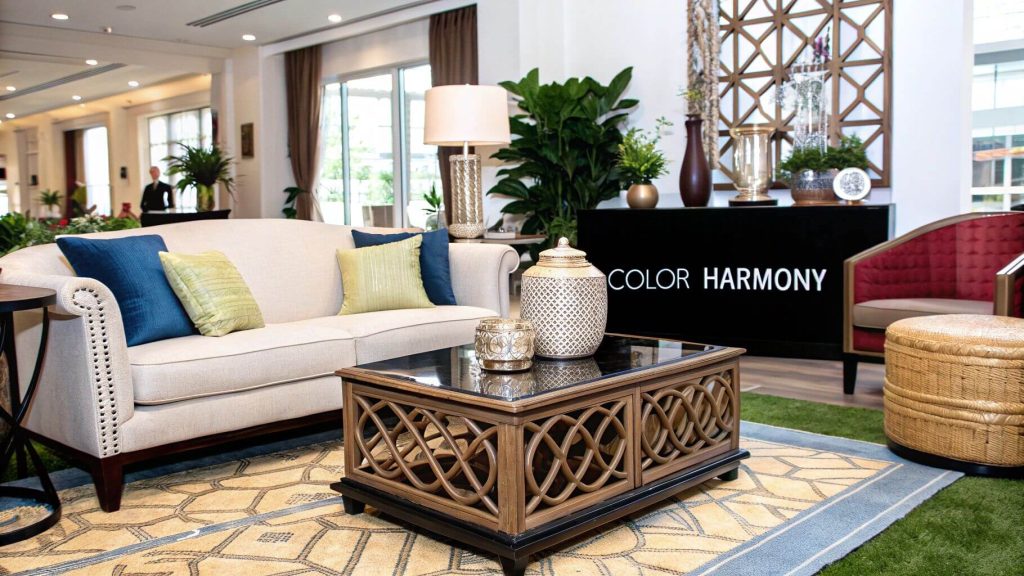
Crafting Cohesive and Sophisticated Palettes
Knowing what a single color can do is one thing, but learning how to weave them together into a cohesive palette is what separates a merely decorated room from a truly designed space. It’s the art of creating a unified, immersive experience, not just curating a collection of beautiful objects. Luckily, designers have time-tested frameworks for building these sophisticated color stories.
One of the most reliable guides is the 60-30-10 rule. Think of it as a professional recipe for achieving visual balance. Following this simple principle ensures your palette feels intentional and harmonious, not chaotic.
- 60% Dominant Color: This is the main character of the room. It’s the hue that covers the largest surface areas—usually the walls—and sets the overall mood.
- 30% Secondary Color: This color is there to support the dominant shade, used for about half the area. You’ll see it in furniture, drapery, or perhaps an accent wall.
- 10% Accent Color: These are the final, impactful touches. They’re the pops of color in throw pillows, artwork, or accessories that inject personality and draw the eye.
This structure gives you a clear roadmap, preventing any one color from overwhelming the space and guaranteeing a polished, professional result.
Mastering Classic Palette Strategies
Beyond the 60-30-10 rule, designers lean on a few classic strategies to achieve specific emotional goals. These aren’t rigid mandates, but they serve as fantastic starting points for creating a particular atmosphere. Getting comfortable with these is key to mastering color in interior design.
A monochromatic palette is one of the quickest paths to a serene, minimalist retreat. The approach is simple: you use varying tones, shades, and tints of a single color. A bedroom, for instance, might layer everything from a pale, misty blue on the walls to a deep, inky navy on the headboard. The result is a look that feels both simple and deeply sophisticated.
What you get is an incredibly cohesive and calming environment where texture—a nubby blanket, a velvet chair, a silk curtain—suddenly becomes the star. A monochromatic scheme whispers restraint and intention, a true hallmark of modern luxury.
Building Harmony with Analogous Colors
For a palette with a bit more complexity that still feels completely harmonious, designers often turn to analogous colors. This strategy involves choosing three colors that sit right next to each other on the color wheel—think blue, blue-green, and green. Because they share a common color, they blend together seamlessly.
This approach is perfect for creating a rich, layered look that feels organic and incredibly calming. Imagine a living room that flows from a soft sage on the walls to deeper forest green upholstery, all brought to life with small accents of teal. The effect is nature-inspired, peaceful, and effortlessly elegant.
By using colors that are neighbors on the color wheel, you create a visual language that is inherently pleasing and easy for the eye to process, resulting in a tranquil and inviting space.
Injecting Energy with Complementary Palettes
When the goal is to create a jolt of energy or high-impact drama, a complementary palette is the go-to tool. This strategy pairs two colors directly opposite each other on the color wheel, like blue and orange or red and green. The stark contrast between them creates a vibrant, energetic tension.
In a luxury setting, this rarely means painting a room in equal halves of two bright colors. It’s all about strategic application. A largely neutral living space can be absolutely electrified by a deep sapphire blue sofa and a few thoughtfully placed terracotta cushions. The contrast makes both colors sing.
This technique is incredibly powerful for creating memorable focal points and infusing a space with confidence. The key is to let one color dominate and use its complement as a targeted, impactful accent—always keeping the balance of the 60-30-10 rule in mind.
The Future of Personalized Color Design
The world of color psychology in design is on the cusp of a fascinating new era. We’re seeing a powerful fusion of technology and a renewed appreciation for cultural diversity, which is completely changing how we approach emotionally intelligent spaces.
We are quickly moving beyond broad, generic color meanings and stepping into a future of hyper-personalization. This isn’t about simply following a trend; it’s about crafting a palette that is uniquely, scientifically, and emotionally yours.
This evolution is being supercharged by advancements in artificial intelligence. New AI-powered tools can analyze immense amounts of data to develop palettes that connect with us on a much deeper level than ever before. Think of a system that goes beyond suggesting “calming blues” and instead curates a specific shade of cerulean scientifically aligned with your psychological profile, your daily routines, and even your personal memories.
It’s a major departure from the one-size-fits-all advice of the past. The conversation is becoming far more nuanced, acknowledging that a color’s emotional impact isn’t universal but is profoundly shaped by our individual lives and cultural roots.
The Rise of AI-Driven Palettes
For designers, artificial intelligence is becoming an essential creative partner. It acts as a powerful research assistant, processing information at a scale no human could, and enhancing—not replacing—a designer’s intuition with solid, data-driven insights. This allows for a far more precise and effective use of interior design color psychology.
These sophisticated algorithms can:
- Analyze Personal Data: AI can interpret information from questionnaires covering lifestyle, personality, and even stress levels to recommend colors proven to support specific emotional states.
- Predict Color Harmonies: By sifting through millions of successful designs, AI can generate complex, unexpected palettes that a designer might not have imagined, all while ensuring perfect balance.
- Adapt to Environmental Factors: Advanced tools can now simulate how a paint color will look in a specific room, taking into account the unique quality of its natural light as it changes throughout the day.
This meticulous level of detail is already making waves in the industry. For a closer look at this trend, our article on how AI is reshaping luxury interior architecture explores its impact on high-end projects.
A More Inclusive and Global Approach
Technology is also paving the way for a more inclusive and global perspective on color. AI is breaking down cultural and geographic barriers, bringing together design influences from every corner of the world to start entirely new aesthetic conversations. The future of color is not monolithic; it’s a rich and vibrant fusion.
The next wave of design innovation lies in creating spaces that are not just beautiful, but deeply and intelligently attuned to our individual emotional needs, cultural heritage, and personal history.
By 2025, it’s expected that AI-driven tools will analyze global data to pinpoint emerging cultural fusion trends, blending African earth tones with Asian pastel aesthetics and vibrant Latin American hues. In fact, the adoption of AI in visual design is projected to jump by 30%, fast-tracking the personalization and psychological fine-tuning of interior spaces around the globe.
This places designers right at the forefront of innovation. They are now empowered to create homes that are not just visually stunning but are true, authentic reflections of the people who live in them. The future of color design is intelligent, personal, and beautifully complex.
Common Questions on Interior Design Color
Moving from color theory to the real world is where the magic—and the questions—really begin. It’s one thing to understand the principles of color psychology, but applying them can feel like a mix of art and science. It’s completely normal to hit a few roadblocks along the way.
This section is your go-to guide for those practical hurdles. We’ll tackle some of the most common questions that pop up for designers and homeowners alike, giving you clear, actionable answers to help you make those big decisions with confidence. Think of it as a problem-solving session, covering everything from picking the perfect neutral to going bold with dramatic hues.
How Do I Choose the Right White for My Room?
This one is a classic. Choosing the “right” white is one of the most deceptively tricky decisions in all of interior design. The secret is knowing that white is almost never just white. It’s always carrying subtle undertones that will completely change how it looks and feels depending on the light in your room.
Cool whites have hints of blue, gray, or green. They give off a crisp, clean, almost gallery-like vibe, which makes them a fantastic choice for modern, minimalist spaces or any room that gets a ton of warm, direct sunlight.
On the other hand, warm whites lean into yellow, pink, or beige undertones. These shades instantly make a space feel cozier, softer, and more inviting. They’re perfect for living rooms, bedrooms, or anywhere you want to create a sense of comfort—especially in rooms with cooler, north-facing light.
The only way to be sure is to test large paint swatches directly on your walls. Watch them at different times of day—morning, noon, and night. You have to see how natural and artificial light play with the color before you commit.
Can I Use Dark Colors in a Small Room?
Absolutely. The old rule that you have to paint small rooms white to make them feel bigger is completely outdated. In fact, embracing a deep, moody color like charcoal, navy, or a rich forest green can have a stunningly sophisticated effect.
This approach creates what designers call a “jewel-box” atmosphere. It makes a small space feel intentional, cozy, and incredibly luxurious. It’s a confident move that can make architectural details pop in a way a pale color never could.
The trick to pulling it off is all about balance:
- Light It Up: Make sure the room has great lighting, both natural and artificial. A few well-placed lamps can keep the space from feeling gloomy.
- Lean on Reflection: Bring in mirrors, metallic accents, or glossy finishes. These surfaces will bounce light around the room, adding brightness and a sense of depth.
- Create Contrast: Pair those dark walls with lighter-colored furniture and textiles. This contrast keeps the room from feeling too heavy and creates a beautiful visual tension.
If you’re still hesitant, an accent wall is another brilliant way to introduce that depth and drama without committing to the whole room.
What Is the Biggest Color Mistake People Make?
Honestly, one of the most common mistakes is just playing it too safe. So many people are afraid of making the “wrong” choice that they default to an all-neutral palette. While neutrals are a beautiful foundation, a space without any real color can end up feeling sterile, bland, and just plain uninspired.
Another huge error is underestimating the power of lighting. That little paint chip you loved under the harsh fluorescent lights of the hardware store is going to look completely different in your home. The way natural light pours in, the warmth or coolness of your lightbulbs—even the green trees outside your window—will all change how a color reads.
Finally, a big one is failing to create a cohesive color story that flows from one room to the next. A well-designed home feels connected. The color transitions should feel intentional and harmonious, creating a single, unified living experience rather than a collection of disjointed spaces.
How Does Culture Affect Color Psychology?
Culture’s influence on how we interpret color is massive, and it’s something every great designer has to consider. A color that one culture sees as celebratory and positive might be associated with mourning or danger in another.
Here are a couple of powerful examples:
- White: In the West, white is all about purity, peace, and minimalism. It’s the color of weddings and clean, modern design. But in many Eastern and Asian cultures, white is traditionally the color of funerals and mourning.
- Red: In China, red is incredibly significant, representing luck, joy, and prosperity. Travel to South Africa, however, and red is the color associated with loss and grief.
A globally-minded designer has to be sensitive to these nuances. Taking the time to understand a client’s background and cultural associations with color is what separates good design from great design. It ensures the palette creates the right emotions and makes the space feel respectful, welcoming, and deeply personal.
Ready to connect with top-tier design professionals who master the art and science of color? Haute Design is the premier network linking discerning clients with the nation’s leading interior designers, architects, and builders. Discover experts who can transform your space.