
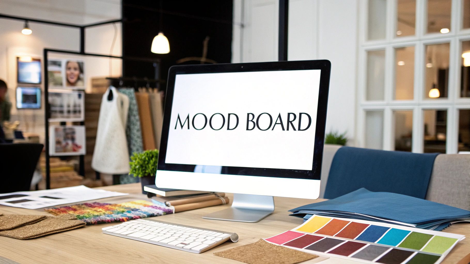
A mood board is far more than just a collage of pretty pictures. It’s a powerful tool that captures the entire feeling of a space before a single piece of furniture is ordered. Think of it as the visual language of a project—a way to translate abstract ideas like “sophisticated comfort” or “serene minimalism” into something everyone can see and understand.
Translating Emotion Into A Tangible Vision
At its heart, a mood board is the bridge between a client’s initial thoughts and a designer’s creative vision. It’s a carefully edited collection of images, textures, color palettes, and even words that work together to tell a story and set the tone for the entire project.
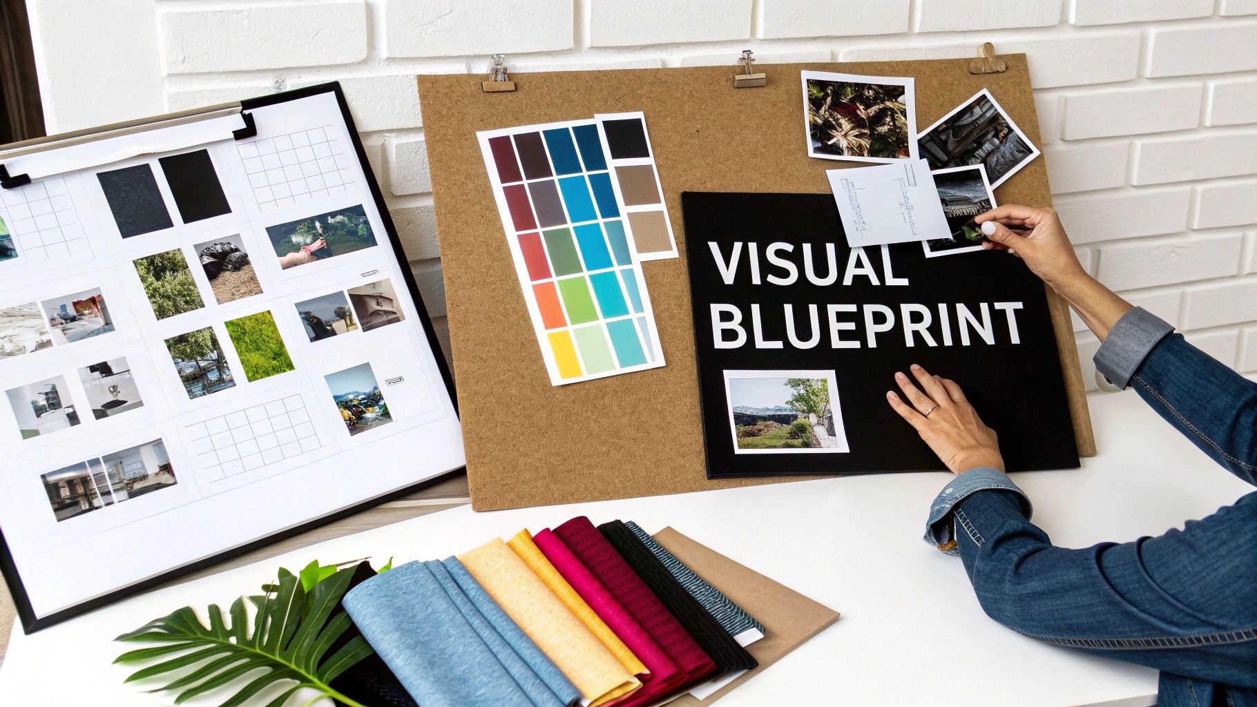
I like to call it the ‘visual blueprint for emotion.’ It’s where the soul of a design first takes shape. For any creative professional, especially an interior designer working on high-end projects, this board becomes the single most important alignment tool. It gets everyone—from the design team to the client and even the contractors—on the same page from day one.
Establishing a Unified Direction
Getting this early visual agreement is critical, particularly in the luxury sector where the stakes are high and the details matter immensely. A well-crafted mood board isn’t just a presentation piece; it’s a strategic move that sets the project up for success.
Here’s what it helps achieve right from the start:
- Secures Client Buy-In: It gives clients a chance to react to the proposed direction on an emotional level, ensuring we’re all aligned before significant time and money are spent.
- Prevents Costly Misunderstandings: With a clear visual reference, there’s no room for misinterpretation. This drastically cuts down on the risk of expensive changes later on.
- Anchors All Future Decisions: This board becomes our North Star. Every choice, from the texture of a throw pillow to the finish on a light fixture, is measured against it.
A mood board is the conversation starter for a design project. It’s not just about showing pretty images; it’s about creating a dialogue and confirming that both designer and client are telling the same story.
This visual conversation paves the way for a seamless project execution. By establishing a clear, agreed-upon direction, it protects the project’s creative integrity and, just as importantly, its budget. The ability to connect visuals with emotion is what separates a good design from a truly memorable one. If you want to dive deeper into this, you can learn more about mastering interior design color psychology in our related article.
A truly effective mood board is built from several key ingredients that work in harmony. The table below breaks down these core components, showing how each piece contributes to the overall narrative.
Core Components of an Effective Mood Board
| Element Type | Purpose in Design | Example for a Luxury Living Room |
|---|---|---|
| Inspiration Images | Sets the overall mood and aesthetic. These are not literal but capture the desired feeling. | An image of a serene, mist-covered forest; a photo of a tailored cashmere suit; a detail shot from a boutique hotel lobby. |
| Color Palette | Defines the primary, secondary, and accent colors that will guide all material selections. | Swatches of deep navy, warm greys, cream, with a bold accent of brass or burnt orange. |
| Materials & Textures | Adds depth and tactile quality. Communicates how the space will feel to the touch. | Samples of plush velvet, raw silk, polished marble, dark walnut wood, and a hand-knotted wool rug. |
| Furniture & Lighting | Shows key shapes, styles, and silhouettes that will anchor the room. | A photo of an iconic mid-century armchair, a sculptural floor lamp, and a modern, clean-lined sofa. |
| Key Words & Text | Provides conceptual anchors and reinforces the core theme with evocative language. | Phrases like “Refined Sanctuary,” “Quiet Luxury,” or “Timeless Comfort” printed in an elegant font. |
By thoughtfully combining these elements, a mood board becomes a comprehensive and compelling tool that guides the entire design journey from concept to completion.
The Strategic Purpose of a Mood Board
While a mood board is certainly a creative exercise, its real power in a professional design project is strategic. It’s not just a pretty collection of inspiring pictures. Think of it as a critical business tool that aligns expectations, minimizes expensive mistakes, and sets a rock-solid foundation for everything that follows. This is especially true in the world of luxury design, where the stakes are high and perfection is the only acceptable outcome.
At its core, a mood board takes a project from a nebulous idea to a concrete, actionable plan. It bridges the gap between words and visuals. After all, one person’s “elegant” might be another’s “ornate,” and “modern” can mean a dozen different things. The mood board cuts through that ambiguity, translating subjective feelings into a shared visual language so the client and designer are truly on the same page.
Securing Early Client Buy-In
One of the most valuable things a mood board does is get the client’s enthusiastic “yes” at the very beginning. When you present a visual concept, you give clients a chance to connect with the proposed design on an emotional level. That initial agreement is like a handshake, confirming that everyone is working toward the same vision.
This isn’t about forcing a final design; it’s about starting a conversation. The mood board invites feedback and allows for tweaks before any real money is spent on sourcing materials or commissioning custom furniture. Getting this alignment right from the start prevents costly changes later on—the kind of changes that can inflate budgets on high-end projects.
For a designer, a mood board is the ultimate communication asset. It demonstrates a deep understanding of the client’s desires and proves the design concept is viable, building trust and confidence from the very first presentation.
Essentially, the mood board makes the vision tangible and gets everyone to sign off on it. To see how this initial vision evolves, our guide on what is a design concept is a great next step.
A Constant Point of Reference
Once the client approves it, the mood board becomes the project’s North Star. It’s the single source of truth for every person involved, from the architect and builder to the lighting consultant and furniture maker. Every single decision—from the texture of a fabric to the finish on a doorknob—can be held up against the board to make sure it fits the original intent.
This visual guide is what keeps a complex project consistent and cohesive from start to finish. It’s the best defense against “scope creep,” where lots of small, unrelated decisions slowly water down the big idea. By acting as this central anchor, the mood board keeps the project on track, protects the budget, and ensures the final space is a beautiful, faithful execution of the shared vision.
The Journey From Physical to Digital Mood Boards
The mood board has come a long way. What started as a hands-on, cut-and-paste process has morphed into a sophisticated digital art form, but the soul of the physical board is far from lost.
In the not-so-distant past, a designer’s studio was filled with foam core boards, meticulously layered with fabric swatches, magazine clippings, paint chips, and bits of wood. This was about creating a multi-sensory experience. It gave clients the chance to run their hand over a proposed velvet or see how a slab of marble truly catches the light.
This tactile approach is still incredibly powerful, especially in the world of luxury interiors. There’s a certain magic in seeing and touching real materials together. It makes a vision feel real, bridging that crucial gap between an idea and the final space. It’s not just about what a room will look like, but what it will feel like.
The Rise of Digital Mood Boards
Then, of course, the digital world changed everything. Platforms like Pinterest and a host of specialized design programs completely reshaped how we build and share visual concepts. A process that once took hours of meticulous assembly can now be done in minutes.
This shift has made the initial brainstorming stages faster and more fluid than ever before. Designers can now tap into a bottomless well of inspiration, pulling images from all over the world and testing out different pairings with a few clicks. This agility allows for rapid exploration, making it easy to present a client with several distinct creative paths without a huge investment of time or physical materials.
Whether it’s a physical board covered in fabric or a pixel-perfect digital collage, the core purpose of a mood board hasn’t changed: it’s about translating a feeling into a visual plan. The tools have just gotten more versatile.
A Hybrid Approach for Today’s Designer
So, what do the best designers do today? They don’t choose one or the other—they use both. The most effective strategy is often a hybrid one, blending the speed of digital with the impact of physical materials.
It usually starts with a digital mood board. This is perfect for quickly hammering out the overall aesthetic, defining the color story, and getting everyone on the same page conceptually. It’s easy to share, allows for remote collaboration, and keeps the project moving forward.
But once that digital vision gets the green light, it’s often followed by a beautifully curated material board. This is where the key fabric swatches, tile samples, and metal finishes come into play, giving the client that vital, hands-on preview. Mood boards may have roots in the early 20th century, but their modern power comes from this deep integration with technology. In fact, 92% of luxury interior designers now use digital tools like Pinterest, which itself has over 500 million monthly users. For high-net-worth clients, this process is invaluable; a well-executed mood board can shorten project timelines by 20-30%, ensuring a multimillion-dollar project perfectly hits the mark. You can explore more about the historical and modern uses of mood boards to see just how far they’ve come.
This blended approach is the best of both worlds. It combines digital efficiency with a genuine emotional connection, proving the mood board remains an indispensable and incredibly adaptable tool in the designer’s arsenal.
How to Build a Compelling Mood Board
Crafting a mood board that truly sings—one that inspires the client and anchors the creative vision—is less about gathering pretty pictures and more about telling a story. A truly persuasive board doesn’t just show what a space could look like; it justifies every single creative decision before it’s even made.
The process doesn’t start with scrolling through images. It begins with a narrative. Before you pin a single thing, you need to define the core concept. What’s the central feeling this space needs to evoke? Who are we designing for, and what’s their story? Answering these questions first gives you a powerful filter, ensuring every element you choose serves one central theme. This is what turns a simple collage into a strategic design tool.
Sourcing and Curating Your Inspiration
With that core idea locked in, it’s time to gather your visual assets. Don’t just stick to the usual suspects. While design magazines and blogs are great starting points, the real magic often comes from unexpected places. Look to fine art, the textures of the natural world, a detail from a fashion runway, or even the color grading in a favorite film. This is how you introduce unique textures and surprising color combinations that feel fresh and personal.
The real skill here is in the curation, not just the collection. Think of it as editing. You want a balanced mix of elements that work together to tell your story.
- Broad Strokes: Start with 2-3 large, impactful images. These are your anchors, setting the overall atmosphere.
- Specific Details: Layer in smaller images that highlight key textures, material finishes, and potential furniture silhouettes. Think of these as the supporting characters.
- Color Palette: Pull out 5-7 core color swatches. These will define your primary, secondary, and accent hues for the entire project.
This intentional curation process is what keeps your board from becoming a cluttered mess of disconnected ideas. A well-balanced mood board guides the eye, communicates the vision with clarity, and radiates confidence.
The tools we use to do this have come a long way, evolving from purely physical boards to the powerful digital platforms we have today.
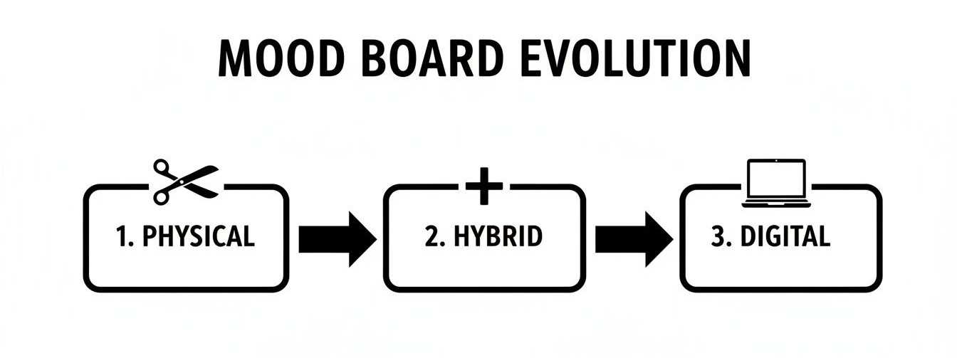
This evolution from scissors and glue to sophisticated digital and hybrid methods just goes to show how adaptable and essential this tool really is for a modern designer.
Establishing Harmony and Hierarchy
Once you have your curated elements, the final step is arranging them. Don’t just throw them on the page. Think like a graphic designer and create a clear visual hierarchy. Let one dominant image anchor the entire board, then arrange the supporting textures, colors, and details around it to create a natural flow.
This is also where adding notes can be a total game-changer. Annotation elevates your board from a collection of images to a persuasive argument. Add brief notes explaining why each element is there. For instance, a photo of a finely tailored suit might represent “structured elegance,” while a swatch of raw silk could signify “understated luxury.”
Annotation is what turns a mood board into a conversation. It demonstrates the strategic thinking behind your creative choices, building client trust and ensuring everyone is on the same page from day one.
This level of detail is non-negotiable in the luxury market. In fact, an incredible 95% of top designers and architects rely on mood boards daily to bridge their creative vision with client expectations. These aren’t just pretty pictures; for elite professionals, mood boards are strategic assets that can boost project success rates by 40%. They do this by catching misalignments early, which helps prevent the 25% average budget overruns that often plague high-end remodels. You can find a deeper dive into how mood boards shape design projects in this detailed analysis. This careful, story-driven process ensures a compelling final product that everyone believes in.
Real-World Examples of Mood Boards in Action
Theory is a great starting point, but seeing a mood board come to life in a real project is where its power truly clicks. When you analyze professional examples, you start to see exactly how designers translate abstract feelings into a concrete, cohesive design language.
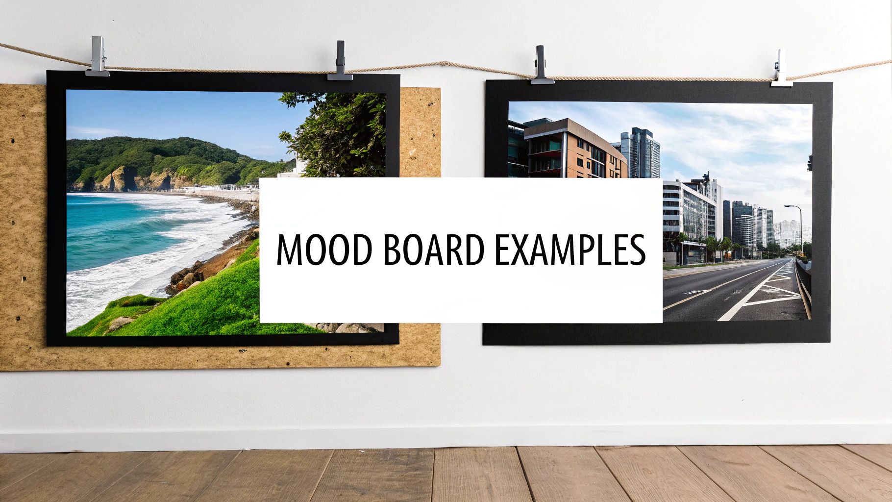
Let’s walk through two distinct case studies for luxury residential projects. We’ll break down how each piece of the puzzle contributes to the final story. This is how a mood board becomes more than a collage; it becomes a visual narrative that guides every decision, from the architectural details down to the last styling touch.
Case Study 1: The Coastal Serenity Master Suite
Picture a client who wants their master bedroom to be a private, high-end coastal retreat. The key words are calm, airy, and restorative. The goal isn’t a kitschy beach theme, but rather capturing the feeling of a serene shoreline at dawn.
The mood board here has to be built around a sensory experience. It’s far more than just slapping down some blue and white—it’s about creating a sophisticated interpretation of the coast.
- Color Palette: The foundation is built on layers of soft off-whites, sandy beiges, and the muted blues of sea glass. To keep the scheme from feeling predictable, a deep, saturated navy is brought in as a sophisticated anchor point.
- Textures and Materials: This is where the concept really gains its depth. The board would feature tactile images of weathered driftwood, rich Belgian linen, hand-knotted wool rugs, and the subtle, elegant veining of Carrara marble. These choices instantly communicate a quiet, organic luxury.
- Lighting and Form: Inspiration images would focus on soft, diffused natural light filtering through sheer curtains. Furniture silhouettes are kept clean and uncluttered, with organic shapes that subtly echo the natural forms of stones and shells.
This careful combination of elements ensures the final space feels calming and grounded, not overtly nautical. The mood board has successfully translated the abstract idea of “serenity” into a tangible, actionable design plan that the client can connect with emotionally. Seeing how top designers pull this off is crucial, and you can explore more stunning interior designer portfolio examples to see these principles in practice.
Case Study 2: The Urban Sophisticate Penthouse
Now, let’s pivot to a completely different world: a sleek, modern penthouse in a bustling city center. The client is a collector of contemporary art and needs a space that feels both dramatic and refined—the perfect backdrop for entertaining. Here, the keywords are bold, structured, and luxurious.
For a project like this, the mood board must communicate confidence and precision. It’s less about soft, organic feelings and more about sharp, intentional design statements.
The entire aesthetic is built on high contrast and rich, deeply tactile materials.
- Core Elements: The board would be anchored by powerful images of brutalist architecture, the sharp lines of a finely tailored suit, and bold abstract art.
- Material Palette: This is where the luxury story is told. Think polished chrome, dark walnut wood, dramatic black-veined marble, and sumptuous velvets in deep jewel tones like emerald or sapphire.
- Mood and Lighting: The lighting inspiration would be layered and theatrical, showcasing sculptural chandeliers and strategic spotlights designed to highlight art. The images would evoke an evening atmosphere, one full of intriguing shadows and reflective surfaces.
In this scenario, the mood board is the critical tool for aligning everyone on a very specific and bold vision. It makes certain that every single material and finish contributes to that desired atmosphere of polished, urban sophistication.
Common Questions About Mood Boards
Even after grasping the basics, it’s natural for clients and even fellow designers to have questions about how a mood board works in practice. Clearing up these finer points is key to making sure this tool is used effectively and not just as a pretty picture.
When everyone understands its purpose, it becomes a powerful bridge between an idea and its execution. Let’s tackle a few of the most common questions that come up in professional design settings.
Mood Board vs. Style Guide: What’s the Difference?
This is a big one. People often use these terms interchangeably, but they play very different roles at different points in a project. They’re related, but one is about exploration and the other is about execution.
Think of a mood board as the initial, creative discovery phase. It’s all about capturing a vibe, an emotion, a feeling. It’s a gut check. A style guide, on the other hand, comes much later. It’s the rulebook, the technical manual that’s created after everyone has signed off on the creative direction.
A mood board is the compass that sets the destination. A style guide is the turn-by-turn GPS that gets you there without a single wrong turn.
A style guide gets into the nitty-gritty, specifying things like:
- Exact color codes (Pantone, hex, or paint formulas)
- Specific font families and their hierarchy for any branding
- Precise material specifications (e.g., “Calacatta Gold Marble, Honed Finish, from ABC supplier”)
How Detailed Should a Client Mood Board Be?
Finding the right level of detail for a client mood board is an art. It needs to be specific enough to paint a clear picture of the design vision, but open enough to invite collaboration. The goal is to start a conversation, not present a final verdict.
A great client mood board usually has just the right amount of information: the core color palette, key textures (like a nubby bouclé or a sleek stone), and a few aspirational images showing furniture shapes or lighting styles. In my experience, a tightly curated collection of 15-20 powerful images is far more effective than a chaotic board of 50. It shows focus and confidence, while still leaving space for the client’s voice to be heard.
Can Mood Boards Be Used for Architecture?
Without a doubt. For architecture and new builds, a mood board is not just helpful—it’s essential. It’s the tool that sets the tone for the entire project, defining the material language and aesthetic long before anyone breaks ground.
Getting the architect, builder, interior designer, and even the landscape architect on the same visual page from day one is critical. An architectural mood board might feature:
- Inspirational photos of building exteriors to establish a style.
- Close-ups of window details or roofing materials.
- Swatches of exterior stone, wood finishes, and planting concepts.
This kind of early alignment can save a project from incredibly costly changes down the road.
Ready to connect with top-tier design professionals who masterfully use tools like mood boards to bring luxury visions to life? Join the Haute Design network and discover a curated selection of the nation’s leading interior designers and architects. Find your perfect design partner on Haute Design.