
Choosing the right paint color doesn’t start in a store aisle surrounded by a thousand different swatches. It begins right where you are, in the room you want to transform. The secret is to work inside-out, starting with your room’s unique lighting and its most permanent features.
This approach—analyzing before you choose—is what separates an okay result from a truly intentional and harmonious space.
Start With Your Room’s Unique Light and Features
Before you even think about picking up a paint chip, spend some time getting to know your canvas. The single most important factor that will dictate how a color looks on your walls is light. It’s the foundational first step in learning how to choose paint colors like a seasoned pro.
A color you fell in love with online, like a soft, warm greige, can look beautiful in a sun-drenched, south-facing room but turn dull and flat in a room that faces north. The direction of your windows dramatically changes the quality and color temperature of the light that fills your space throughout the day.
- North-Facing Rooms: This light is cool and indirect, often casting a subtle blue or gray tint on colors. Lighter tones can look a bit subdued here, so don’t be afraid to go with something a little bolder to make it pop.
- South-Facing Rooms: You’ve hit the jackpot for bright, warm light all day long. This golden glow can make any color feel warmer, which means cooler tones can create a wonderful sense of balance.
- East-Facing Rooms: You get the best of both worlds—a bright, warm glow in the morning that shifts to cooler, indirect light in the afternoon. Your paint color needs to be versatile enough to look great in both.
- West-Facing Rooms: The light here is softer in the morning but becomes intensely warm, almost orange, as the sun sets. A warm color can easily feel overwhelming in this kind of evening light.
Before you start looking at paint swatches, it helps to ground your decision-making process by considering the most critical factors. This table provides a quick reference for the essential elements that will guide your choices.
Key Factors for Choosing Paint Colors
| Factor | Why It Matters | Actionable Tip |
|---|---|---|
| Natural Light | The direction and intensity of sunlight dramatically alter how a color is perceived, changing its warmth and vibrancy throughout the day. | Observe the room at different times—morning, noon, and evening—to see how the light changes and affects your current wall color. |
| Fixed Elements | Features like flooring, countertops, cabinetry, and tile have undertones that your wall color must complement to create a cohesive look. | Bring paint swatches home and place them directly against your floors, fireplace, and cabinets to check for clashing undertones. |
| Room Size & Ceiling Height | Lighter colors can make a small room feel more open and airy, while darker, moodier colors can make a large space feel cozier. | For low ceilings, consider painting the ceiling a shade lighter than the walls to create an illusion of height. |
| Artificial Lighting | The type of lightbulbs you use (e.g., warm white, cool white, daylight) will cast their own color temperature on your walls after the sun goes down. | Test your paint samples under your room’s actual artificial lighting at night. What looks good in daylight might not work under a lamp. |
Considering these factors upfront saves you from the frustration of a color that just doesn’t feel right. It turns a game of guesswork into a strategic design decision.
Assess Your Fixed Elements
Beyond the light, every room has features that aren’t going anywhere. These fixed elements are the non-negotiables you have to design around. We’re talking about things like your hardwood flooring, kitchen countertops, that beautiful brick fireplace, or even a large sofa you have no plans to replace.
Your paint color has to get along with these features. The best way to check is to lay paint swatches right next to them. Does that trendy cool gray you love suddenly clash with the warm, golden tones in your oak floors? Does that crisp, pure white make your creamy marble countertops look dingy by comparison?
The goal is to create a cohesive look where the walls feel connected to the rest of the room. Don’t fight your home’s existing character; listen to what it needs.
This careful process of observation is a cornerstone of great design. Understanding how paint interacts with a room’s light and architecture is fundamental to any project, a concept explored deeply in this helpful interior design space planning guide. When you start with a thorough assessment of what you already have, you move from guessing to making an informed, confident decision.
Understand Undertones to Avoid Costly Mismatches
Have you ever picked the “perfect gray” paint chip at the store, only to have it look strangely purple on your walls? Or watched a beautiful beige turn an unflattering shade of pink once it dried? This is the classic, and costly, mistake of ignoring paint undertones.
Beyond the obvious color you see on the surface is a subtle, underlying hue. That’s the undertone, and it’s the secret language of paint. It dictates whether a color feels warm (with a yellow, orange, or red base) or cool (with a blue, green, or purple base).
Getting this right is what separates a designer-quality result from a frustrating do-over. The undertone is what causes colors to clash, especially when you introduce a new paint color to a room full of existing finishes.
For example, imagine your kitchen has beautiful countertops with a cool, blue-gray vein running through them. If you paint the walls a greige with a warm yellow undertone, the whole room will feel slightly off. The colors will fight each other, creating a disjointed look you can’t quite put your finger on.
How to See What’s Hiding in a Color
Learning to spot undertones is a skill, but it’s one you can develop quickly. It takes the guesswork out of choosing colors and prevents those expensive mismatches. Here are a couple of my go-to methods for uncovering a paint’s true nature.
The best trick is simple comparison. Place your paint chip next to a pure, primary color. If you put a gray swatch next to a true blue and the gray suddenly looks a little bit green, you’ve just found its undertone. Similarly, holding a supposedly “white” paint chip next to a plain white sheet of printer paper will instantly reveal if it leans yellow, pink, or blue.
Pro Tip: Never, ever trust the lighting in a paint store. The harsh fluorescent lights can completely change how a color looks. What you see there is almost never what you’ll get at home.
Another fantastic clue is hidden at the bottom of the paint strip. You know how the colors are arranged from lightest to darkest? Look at the most saturated, muddy-looking color at the very end. That dark shade screams its undertone. It will clearly show you the red, yellow, or green base that’s present—just in smaller amounts—all the way up the strip.
Matching Undertones to Your Home’s Fixed Finishes
Once you can spot undertones in paint, it’s time to play detective in your own home. Look at the fixed elements—the things you aren’t changing—and figure out their undertones. This is how you create that seamless, cohesive flow.
Grab your paint samples and lay them directly against these key surfaces:
- Flooring: Look at your wood floors. Do they have warm, golden-red tones, or are they a cooler, ashy gray?
- Countertops: Get close to your stone or laminate. Are the veins and flecks a cool blue, a warm cream, or even a hint of green?
- Cabinetry: Whether they’re wood or painted, your cabinets have a powerful undertone that your wall color absolutely must get along with.
- Backsplash Tile: A “white” subway tile is rarely just white. It’s either a stark, cool white or a softer, warmer, creamy white.
Your wall color doesn’t need to be a perfect match, but its undertone must harmonize with these features. When you ensure the undertones are compatible, you create a thoughtful, layered space that looks and feels professionally designed. It’s the one step that can save you the headache and expense of a full repaint.
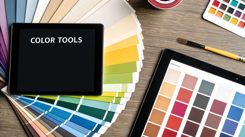
Use Digital Tools and Trends for Real Inspiration
With a solid understanding of your room’s light and undertones, it’s time for the fun part: gathering inspiration. And today, we have some incredibly powerful digital resources at our fingertips.
It’s easy to dismiss color trends as fleeting, but they often reflect a much deeper cultural mood. Major paint companies and design platforms don’t just pick colors out of a hat; they invest heavily in data analysis to see what we’re all gravitating towards. Think of their annual palettes less as a strict rulebook and more as a curated gallery of colors that are already proven to harmonize beautifully. They’re a fantastic shortcut to discovering new combinations you might never have considered.
For instance, Pinterest has become a real-time barometer for design preferences. By analyzing millions of searches, they can pinpoint emerging palettes with stunning accuracy. In fact, over 50% of paint consumers now check out digital color trend reports before making a final decision. It’s a huge shift in how we approach one of the most impactful design choices we can make. You can see exactly how data shapes these collections by exploring the latest trending color palettes from Pinterest.
Filter Trends Through Your Personal Lens
The real secret is to use trends as a starting point, not a final destination. That “color of the year” might look incredible online, but it could clash terribly with your permanent fixtures or the unique light in your home. The goal is to adapt, not just adopt.
Here are a few ways I guide clients to do this:
- Drawn to a bold trend? Don’t feel pressured to paint the whole room. Introduce it as an accent wall, through textiles like throw pillows, or by refinishing a single piece of furniture.
- The popular shade feels too cool? Look for a version of that same hue with a warmer undertone. Every color has countless variations, and one is bound to fit your space better.
- Feeling overwhelmed by brights? Zero in on the neutral colors that accompany the trend. They are often incredibly sophisticated and designed specifically to complement the bolder shades.
This approach keeps your space feeling fresh and current, but still uniquely yours. It’s a timely strategy, as many are looking for ways to create more expressive interiors—a movement you can explore further in our article on why ultra-luxury homes are abandoning minimalist white.
Put Virtual Tools to the Test
This is where technology really shines. The online color visualizer, offered by nearly every major paint brand, is a game-changer for narrowing down what can feel like an infinite number of choices.
By simply uploading a photo of your room, you can instantly see how a color will look on your walls, against your furniture, and in your specific lighting. It’s the closest you can get to painting without ever cracking open a can.
These tools are incredibly efficient for the first round of eliminations. If a color looks jarring in the digital preview, you can confidently cross it off your list. Use these visualizers to narrow your thousands of options down to three to five serious contenders. This saves you time, money, and the headache of dealing with a dozen messy sample pots, creating a seamless bridge from digital ideas to real-world results.
Choose Colors Based on How You Want to Feel
Paint is so much more than a final finish on a wall; it’s the backdrop to your life. It’s an emotional cue that can completely shift the energy of a space. The secret to choosing the right color isn’t just about what looks good—it’s about deciding how you want to feel when you walk into the room. This is where color psychology becomes a designer’s most powerful tool.
The way color influences our mood is almost instantaneous. Cool tones like soft blues, gentle greens, and muted grays are inherently calming. They’re my go-to for spaces designed for rest and concentration, like a primary bedroom or a home office. On the other side of the wheel, warm colors—think rich reds, sunny yellows, and inviting oranges—spark energy and connection, making them perfect for lively kitchens or dining rooms where conversation flows.
Translate Function into Feeling
The real magic happens when you align the room’s purpose with the emotion you want to evoke. Before you even think about picking up a paint swatch, pause and ask yourself: what is this room for?
- For Relaxation: In a bedroom or a quiet reading nook, the goal is pure tranquility. I often recommend colors with low saturation, such as dusty blues, sage greens, or warm, earthy taupes that feel like a gentle hug.
- For Socializing: A dining room or living area is all about encouraging interaction. Here, we can be a bit bolder with deeper, more engaging colors like a warm terracotta, a sophisticated navy, or even a rich cranberry on an accent wall to create a focal point.
- For Productivity: A home office needs to support focus. Greens are fantastic for this because they reduce eye strain and are associated with concentration. Soft, clear blues can also create an atmosphere of calm efficiency.
Your home should be a sanctuary—a place that reflects who you are and supports your well-being. When you choose colors based on feeling, you’re not just decorating; you’re intentionally designing an environment that nurtures the life you want to live.
This intentional approach is becoming a cornerstone of modern design. We’re seeing a huge focus on the psychological impact of color, and this directly influences what clients ask for. Current trends for 2025 are leaning heavily into earthy greens and grounding browns, with 35-45% of projects favoring these tones for living rooms and offices. In fact, data shows that 60% of our clients now ask specifically about how color choices will affect their mood and productivity. You can read more about the color trends shaping modern interiors and see this philosophy in action.
Go Beyond Hue to Intensity
But it’s not just the color family that dictates the mood; the intensity of the hue is just as critical. A pale, barely-there green will create a serene, airy vibe, while a vibrant lime green is electric and packed with energy. In the same way, a soft, buttery yellow feels cheerful and light, whereas a bold marigold can feel intensely joyful and confident.
Thinking about the intended mood ensures your space is not only beautiful but also functional on an emotional level. It’s a core principle that turns a simple paint job into a deliberate act of homemaking, something we explore further in your essential interior design style guide. This thoughtful process is what makes a house truly feel like your own.
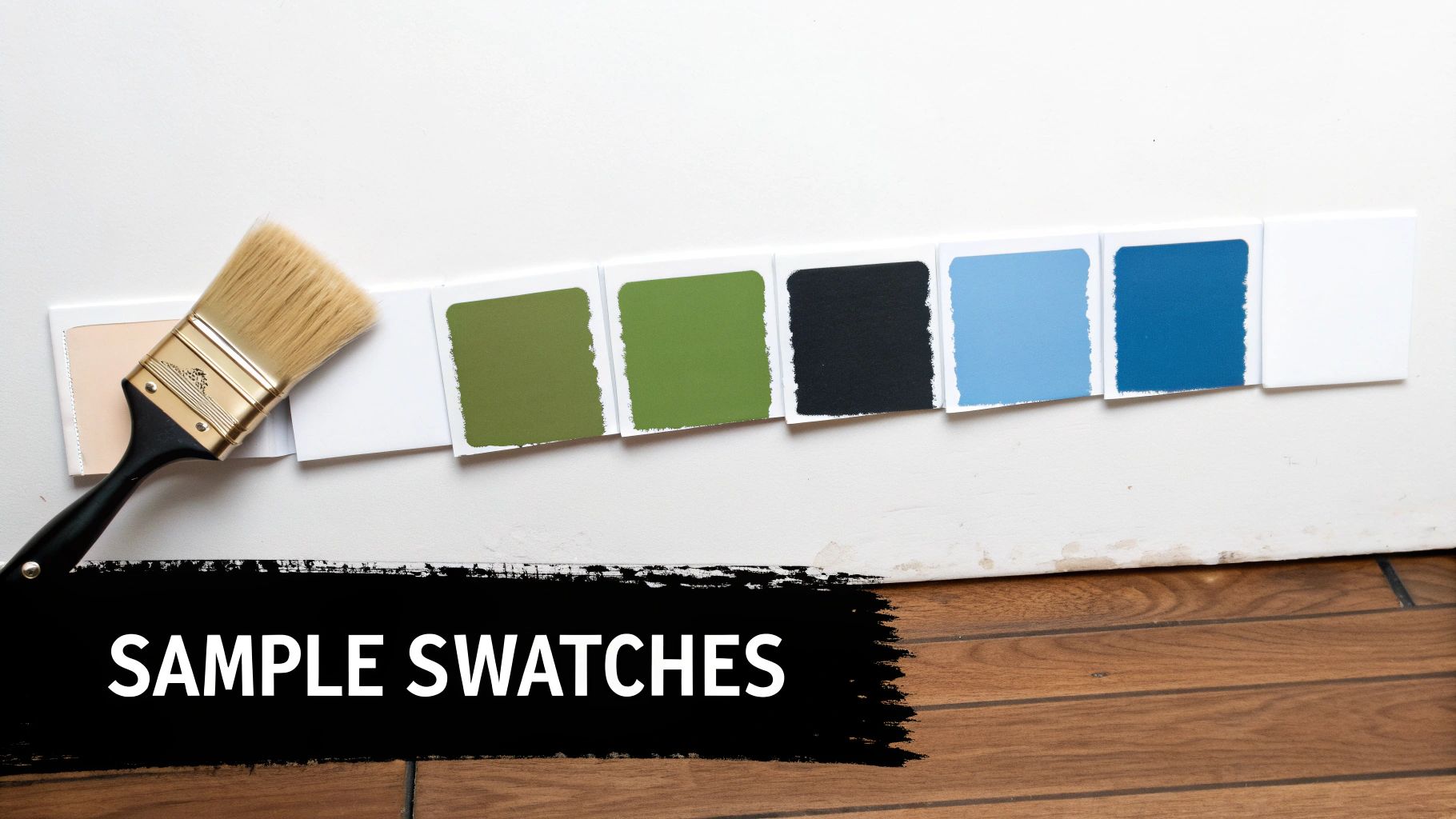
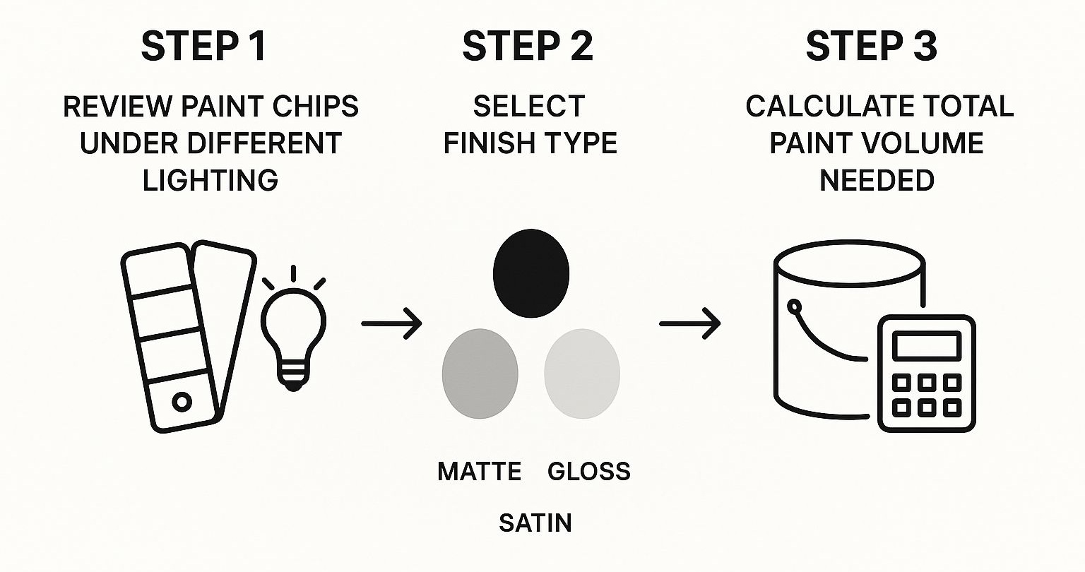
Master the Art of Sampling Before You Commit
You’ve analyzed the light, pinpointed the undertones, and used digital tools to create a shortlist. Now comes the one step I see people skip all the time in their rush to get painting: proper sampling. Honestly, choosing a final color based on a tiny paper chip under the harsh fluorescent lights of a hardware store is a recipe for disaster. It’s the number one reason a color looks completely different once you get it home.
To truly feel confident in your choice, you have to see the color in its natural habitat. The color on a chip is just an idea; the color on your wall is reality. The only way to bridge that gap is by testing large samples in the actual room, where they’ll interact with your specific lighting, flooring, and furniture.
Beyond the Tiny Paper Swatch
The goal here is to create a sample large enough to give you a real sense of the color’s presence. Small swatches just get lost on a big wall, and their appearance is skewed by the existing wall color surrounding them. To judge a new color accurately, you need to isolate it.
I’ve found two methods work best for my clients:
- Peel-and-Stick Samples: Services like Samplize offer large, pre-painted adhesive swatches. These are fantastic because they’re mess-free and you can move them around the room to see how they look in different spots. Best of all, they show the genuine paint color and finish without you ever lifting a brush.
- DIY Sample Boards: The classic approach. Just grab a few white poster boards or foam core sheets and paint your sample colors right onto them. Make sure to apply two coats to get the true, saturated color. This gives you large, portable swatches you can test anywhere.
Once you’ve used your samples to lock in the perfect shade, this visual guide can walk you through the final details, like choosing the right finish and calculating how much paint you’ll need.
Think of this as your final checklist before you head to the store, ensuring no detail gets missed before you commit.
The Strategic Placement of Samples
Where you put your samples is just as critical as how you make them. A color can shift dramatically from one wall to the next as the light moves throughout the day.
My advice is always to place your large samples on multiple walls within the room. Focus on the main wall you see when you walk in, but also put one on a wall adjacent to a window. Watch them over a full day: in the bright morning, at midday, and in the evening under your lamps.
Don’t forget to check the samples directly next to key features—the fabric of your sofa, the wood trim around your doors, and any stone or tile surfaces. Does the undertone in the paint complement these fixed elements, or does it clash?
This methodical process takes all the guesswork out of the equation. It gives you the certainty to invest in gallons of paint, knowing the result will be exactly what you envisioned: a beautiful, cohesive space you’ll love for years to come.
Have a Few Lingering Questions?
Even with a solid plan, the final steps of choosing a paint color can feel a little daunting. It’s completely normal to have a few last-minute questions pop up. After all, getting these final details right is what separates a good result from a truly flawless, professional finish. Let’s walk through some of the most common things people ask at this stage.
What’s the Deal with Paint Finishes?
People often get so focused on the color that they forget about the finish, but the sheen you choose is just as critical. It completely changes how the color looks on the wall and, more importantly, how it holds up to daily life.
Here’s a quick rundown from a practical standpoint:
- Matte or Flat: Think of this as the most forgiving finish. Its chalky, velvety texture is fantastic at hiding minor bumps and imperfections on your walls. It’s perfect for low-traffic spaces where you want a rich, deep color, like a formal dining room or a primary bedroom. The trade-off? It scuffs easily and isn’t very washable.
- Eggshell: This is the go-to for most of my projects. It has just a hint of a soft glow—not shiny, but not completely flat either. It strikes that perfect balance, offering far more durability than matte while still feeling sophisticated. It’s a workhorse for living rooms, hallways, and most bedrooms.
- Satin: When you need serious durability, satin is your answer. It has a noticeable, pearlescent sheen that’s incredibly easy to wipe clean. I always recommend it for high-traffic or high-moisture areas like kitchens, bathrooms, laundry rooms, and especially kids’ rooms where sticky fingerprints are a fact of life.
How Do I Make Sure My Whole House Flows Together?
This is a big one. It’s easy to fall into the trap of picking colors for each room in a vacuum, which can leave your home feeling disjointed. The secret to a high-end, cohesive look is to think of your entire home as one unified palette.
Start by landing on a primary neutral. This will be the backbone of your home’s color story—think of a versatile greige, a sophisticated soft white, or a welcoming warm taupe. This is the color you’ll use in the main arteries of your home, like hallways, stairwells, and any open-concept living spaces. It’s the thread that ties everything together.
Then, you can layer in two or three accent colors. These are your personality shades. You might use one for an accent wall in a bedroom, on the cabinetry in a home office, or for the powder room. Because they all relate back to that primary neutral, you get variety and interest without sacrificing that seamless flow.
The most common mistake I see is designing room by room. A whole-house palette is what gives a home that intentional, designer feel, making it feel like a single, thoughtfully curated space.
This idea of a curated palette is actually a major shift in the design world. For years, we were all focused on a single “Color of the Year.” Now, paint companies are moving toward smaller, more versatile collections. Sherwin-Williams’ 2025 Color Capsule, for example, features nine shades designed to harmonize with each other. It’s a smart move, especially when you consider that 30-40% of consumers look to these annual trend reports for inspiration. It gives you the confidence to build a palette that feels both current and deeply personal.
And What About the Trim and Ceiling?
Ah, the “fifth and sixth walls.” Please don’t treat your trim and ceiling as an afterthought! The standard choice is a crisp, bright white, and it’s a classic for a reason—it creates a clean, sharp contrast that makes your wall color the star.
But if you want to elevate the design, you have other options. For a really sophisticated and modern feel, try a monochromatic look: paint the trim the exact same color as the walls, but use a higher sheen, like satin or semi-gloss. This subtle shift in finish adds architectural interest and can make a room feel bigger.
As for the ceiling, painting it a stark white can sometimes feel a bit abrupt. A designer trick is to use a white that’s tinted with just a few drops of your wall color, or simply choose a white that’s two or three shades lighter than your walls. This softens the transition and creates an illusion of height, making the space feel wonderfully open and airy.
Ready to connect with a design professional who can bring your vision to life? The experts at Haute Design are leaders in creating luxurious, personalized spaces. Find your perfect designer today.